The Record List control functions differently in Form- and Display-type Screens:
This control is available for the following Screen types:
Display type
Email type
Form type
See Screen Types.
Form-Type Screen Usage
Configuration Description
In the Form-type Screen, the Record List control records a record list. The record list is composed of multiple records, of which the Request participant enters data components for each record. The controls used to record each record's data components are designed in a second page of the same Screen containing the Record List control. The page that records the data components of each record cannot be on the same page as the Record List control.
When configuring the Record List control, specify how the record list displays information after the control has recorded each record for the list:
Column Headers: Specify each column header that represents the data components for each record. For example, label a column header
First Nameto indicate that this data component displays each person's first name for each record in the list.Values: For each specified column header, reference the Variable Name setting value for the control on the second page that receives a data component for each record corresponding with each column header. For example, use a Line Input control with a Variable Name setting value of
LineInputFirstNameto receive each person's first name for each record in the list, and then associate thatLineInputFirstNamevalue with theFirst Namecolumn.
After configuring the columns for the record list, sort the order in which they are to display in the record list.
Alternatively, use JSON format to configure the columns and their corresponding Variable Name setting values in their respective order to display in the Record List control.
Optionally, values can be edited after the Request participant initially enters the record(s) in the record list. However, after the Request participant submits the Screen, the record list cannot be changed.
Experience Description
Expect a similar experience as a Request participant when using a properly configured Record List control during a Request as follows:
Open the Task with the Screen using the Record List control. The Record List control displays an empty record list.
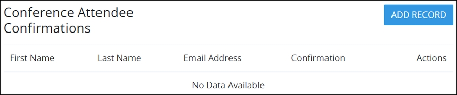
Click the Add Record button to add a record to the record list. A screen displays to enter data components for one record. In doing so, the Record List control references the controls on the secondary page of the Screen. In this example, enter a record for registrars for a conference.
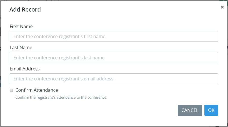
Enter information for each data component for the record.
Click the OK button and ignore the Submit control.
Repeat Steps 2 through 4 for each record in the record list. As you enter each record, it displays in the record list. If the Record List control is configured to be editable (as shown below), then the Edit button
 and Delete button
 display to edit or delete a record, respectively. Otherwise, these buttons do not display and records cannot be changed after they are added.
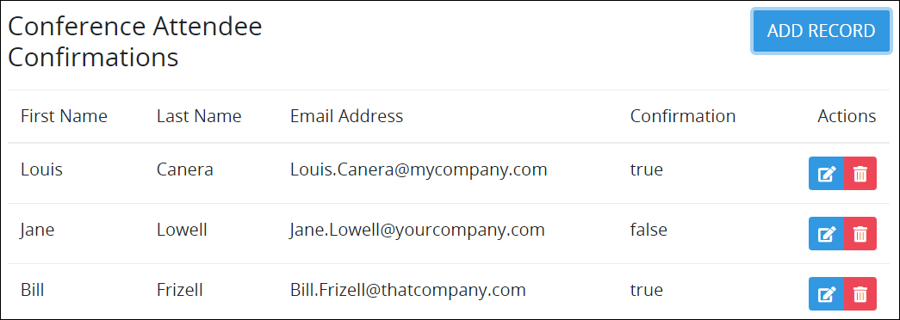
Submit the Screen to save the record list in the Request. After the Task is submitted, the record list cannot be changed.
Display-Type Screen Usage
Configuration Description
In the Display-type Screen, the Record List control displays a record list previously entered into a Form-type Screen in a previous Task of that Request.
When configuring the Record List control, specify how the record list displays information in the Display-type Screen:
Column Headers: Specify each column header that represents the data components for each record in the list. For example, if the record list had recorded first names, then label a column header
First Name.Values: For each specified column header, reference the Variable Name setting value for the control that corresponds with that specified column header's record data component. To do so, open the Screen that contains the Record List control that recorded the list, then locate the control that corresponds with the specified column header's record data component. For example, if a Line Input control with a Variable Name setting value of
LineInputFirstNameis used to record each person's first name for each record in the list, associate thatLineInputFirstNamewith the specifiedFirst Namecolumn header.Repeat this procedure for each column header and its corresponding control that received a record data component for the record list. Make note of each control's Variable Name setting value, as you must provide this same value when configuring each column header in the record list.
After configuring the column headers for the record list, sort the order in which they are to display in the record list.
Alternatively, use JSON format to configure the column headers and their corresponding Variable Name setting values in their respective order to display in the Record List control.
Experience Description
After opening a Task or Manual Task with a Display-type Screen using a Record List control, the record list displays each record as entered in a Form-type Screen in a previous Task of that Request.
Use the _parent JSON Key to Reference Request Data from Controls in a Record List Control
The Record List control uses a unique JSON key available to any control placed into the secondary page from which the Record List control references its values so that those controls can reference Request data. Controls that are placed into that secondary page function within a container and may only access another control's data that is in the same secondary page. Use the _parent JSON key in a control's settings placed into the secondary page to reference Request data outside of that Record List control.
The
_parentJSON key only applies to controls placed into a Record List control or Loop control.
Consider the following examples:
A Line Input control placed into the secondary page requires a default value to display from another Line Input control used during that Request of which its Variable Name setting is
Line_Input_Data. From the Line Input control placed into the secondary page, enter the following into the Default Value setting:{{ _parent.Line_Input_Data }}.A Select List control placed within the secondary page requires its options to display from another Select List control's options used during that Request of which its Variable Name setting is
Select_List_Options. While configuring the Select List control placed into the secondary page to use Request data as its data source, enter the following into the Options Variable setting:{{ _parent.Select_List_Options }}.
Add the Control to a Screen
Permissions
Your user account or group membership must have the following permissions to design a Screen unless your user account has the Make this user a Super Admin setting selected:
Screens: Edit Screens
Screens: View Screens
See the Screens permissions or ask your Administrator for assistance.
Follow these steps to add this control to the Screen:
Create a new Form-type, Email-type or Display-type Screen or edit an existing one.
From the Controls Menu on the left, expand the Content Fields category, and then locate the Record List icon
 .
.Drag and drop the control to the Screen Builder canvas. Existing controls in the Screen will adjust positioning based on where you drag the control.
Do one of the following depending on whether you are using the Record List control on a Form- or Display-type Screen:
Form-type Screen:
Create a new page in this Screen. Use this page to design how the Request participant enters data that the Record List control records. The page that records the submitted records cannot be on the same page as the Record List control. See Add a New Page to a Screen.
On the new page, design the form using controls from which the Request participant enters the data component that the Record List control receives for each record. In each of the controls that receive a data component for each record, make note of the Variable Name setting values for each control; these values correspond with how the Record List control displays the record list in the Value parameter for each column. Do not place a Submit Button control on the new page; otherwise, the Task cannot be submitted during a Request.
Configure each of the controls placed on the new page. If a control placed into this page requires to use Request data, use the
parentJSON key. See Use theparentJSON Key to Reference Request Data from Controls in a Loop Control.Return to the page that the Record List control is placed, and then configure the Record List control. See Settings. Ensure to add a Submit Button or Page Navigation control on the page containing the Record List control so that the Task can be submitted after all records have been added to the record list during a Request.
Display-type Screen:
Configure the Record List control. See Settings.
Validate that the control is configured correctly. See Validate Your Screen.
Example
Consider the following example how to use a Record List control in a Form-type Screen. Configure a Record List control to record the following data components about registrars for a conference. The table below shows how the Record List control displays the record list. Configuring each column and the Variable Name setting value for each control that records the data component that displays in that column is the same for both Form- and Display-type Screens.
On a second page in the same Screen, use Screen controls for Request participants to enter data components for each record. Ensure the following:
The Record List control references the specified controls on the second page. The controls that receive the record data components cannot be on the same page as the Record List control.
In each of the controls that receives a data component for each record, make note of the Variable Name setting values for each control; these values correspond with how the Record List control displays the record list in the Value parameter for each column. This setting is in the Columns panel. See Settings.
The following table outlines how to configure the Column Header and Value settings for each column in the Record List control for this example.
Control Type | Control's "Variable Name" Value | Record List "Column Header" Value | Record List "Value" Value | What It Represents |
|---|---|---|---|---|
Line Input | firstname | First Name | firstname | Registrar's first name |
Line Input | lastname | Last Name | lastname | Registrar's last name |
Line Input | Email Address | Registrar's email address | ||
Select | confirmation | Confirmation | confirmation | Attendance confirmation |
The following image shows the Column Header and Value setting values in the Record List control to reference the Line Input control with the Variable Name setting value of firstname.
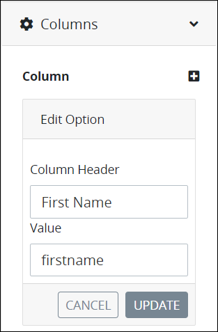
"Column Header" and "Value" settings to reference a Line Input control
The following image shows the column configuration for the Record List control. See Settings for the Record List control setting descriptions.
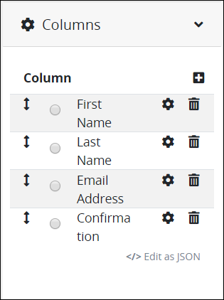
Record List control that contains columns to display a record list
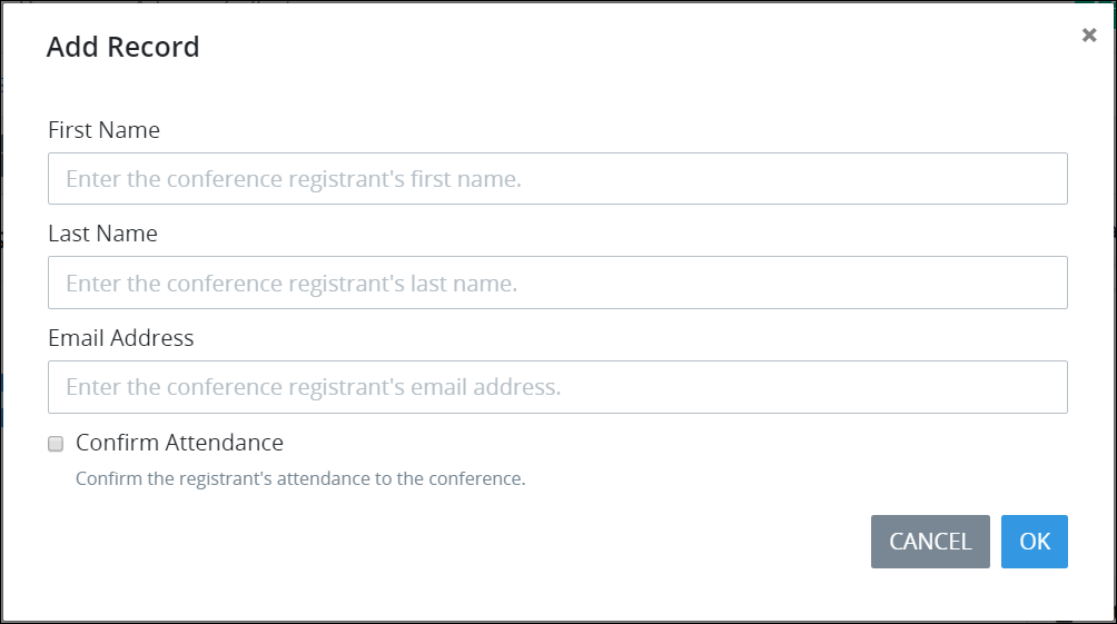
Below is the secondary page in Preview mode for each conference attendee to enter a record.
Form-Type Screen Settings
The Record List control has the following configurable settings in the Properties Panel for Form-type Screens:
Variable Panel Settings
Expand the Variable panel from the Properties Panel on the right to configure the following properties:
Variable Name
Edit the default Variable Name setting value for this control if necessary. The Variable Name setting value represents data in this control during Requests. Ensure that the Variable Name setting value is a unique name from other controls in this Screen and contains at least one letter. This is a required setting.
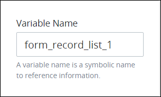
Use the Variable Name setting value in the following ways:
Reference this control by its Variable Name setting's value.
Reference this control's value in a different Screen Builder control. To do so, use mustache syntax and reference this control's Variable Name value in the target control. Example:
{{ form_record_list_1 }}.Reference this value in Visibility Rule setting expressions.
See best practices when editing a Request variable name.
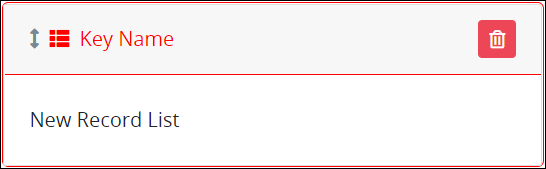
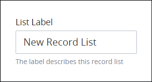
List Label
Edit the default label that displays for this control if necessary. New Record List is the default value.
Configuration Panel Settings
Expand the Configuration panel from the Properties Panel on the right to configure the following properties:
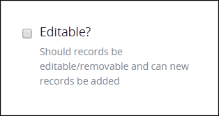
Editable
Select to indicate that records in the list can be edited or deleted with the Editand Deleteicons, respectively. Otherwise, deselect to indicate that after each record is added to the record list, it cannot be changed. Note that after the Task is submitted, the record list cannot be changed. This setting is not selected by default.
Record Form
Select from which Screen page to reference the controls that receive data components for each record. The page with these controls that receive the data components cannot be on the same page as the Record List control.
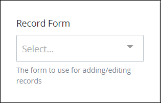
The following message displays if no additional pages exist in this Screen from which to reference other controls: No Data Available.
Columns Panel Settings
Expand the Columns panel from the Properties Panel on the right.
See the following procedures how to configure the column header(s) that display the record list data and from which control(s) on the additional page in this Screen to reference data components of each record for this control.
Add a Column to This Record List Control
Follow these steps to add a column to this control:
Access the Columns panel for this control while in Design mode, and then locate the Column setting.
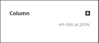
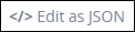
Ensure that the Edit as Options List option displays. If the Edit as JSON option displays, click the Edit as Option List option.
Click the icon
 beside the Column label. The Add Column screen displays.
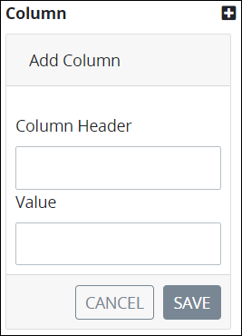
In the Column Header setting, enter the column header label that displays in the record list. This column header represents a data component for each record in the record list.
In the Value setting, enter the Variable Name setting value for the control on the second page of this Screen that receives a data component for each record that corresponds with this column header. For example, use a Line Input control with a Variable Name setting value of
LineInputFirstNameto receive each person's first name for each record in the list, and then associate thatLineInputFirstNamevalue with a column header labeledFirst Name.Click Save. The column header displays in the Column list label.
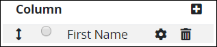
Edit a Column Configuration in This Record List control
Follow these steps to add a column to this control:
Access the Columns panel for this control while in Design mode, and then locate the Column setting.
Ensure that the Column list label displays. If the JSON Data option displays, click the Edit as Option List option.
Click the
 icon for the column to change its settings. The Edit Option screen displays.
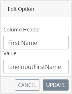
In the Column Header setting, edit the column header label that displays in the record list as necessary. This column header represents a data component for each record in the record list.
In the Value setting, edit the Variable Name setting value for the control on the second page of this Screen that receives a data component for each record that corresponds with this column header as necessary. For example, use a Line Input control with a Variable Name setting value of
LineInputFirstNameto receive each person's first name for each record in the list, and then associate thatLineInputFirstNamevalue with a column header labeledFirst Name.Click Update. The edited column displays below the Column list label.
Delete a Column from This Record List Control
Follow these steps to delete a column from in this control:
Access the Columns panel for this control while in Design mode, and then locate the Column setting.
Ensure that the Column list label displays. If the JSON Data option displays, click the Edit as Option List option.
Click the
 icon for the column to be deleted from this control. A message displays to confirm deletion of the option.
Click Delete.
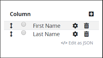
Sort the Order of the Options
Follow these steps to sort the order of the columns that display in this control:
Access the Columns panel for this control while in Design mode, and then locate the Column setting.
Ensure that the Column list label displays. If the JSON Data option displays, click the Edit as Option List option.
Drag the
 icon for each column up or down to sort the order they display in this control as necessary.
Add Columns to This Record List Control Using a JSON Schema
Follow these steps to add a column to this control using a JSON schema:
Access the Columns panel for this control while in Design mode, and then locate the Column setting.
Click the Edit as JSON option below the Column list label if this option does not currently displayed.
The JSON Data setting displays. If a valid JSON schema has been configured previously, the JSON Data setting displays the JSON. Otherwise the setting is empty.
Click the icon
 beside the JSON Data option. The Script Config Editor displays.
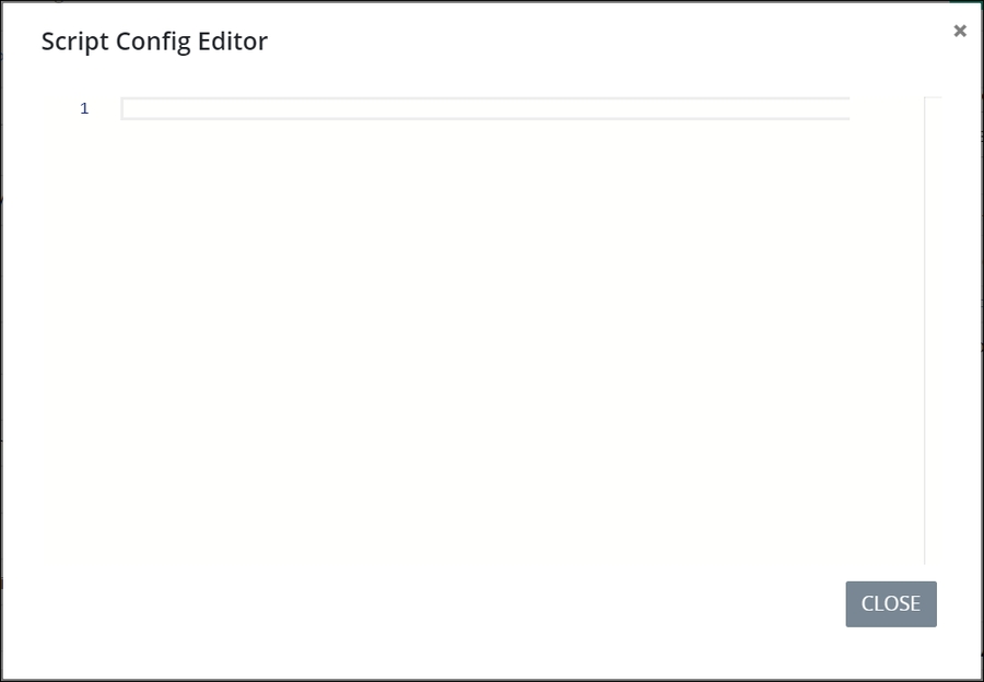
Enter your control columns in the order they are to display in this control using JSON format. Use the scroll panel to the right of the JSON to scroll to different sections of the JSON if necessary. This is useful especially when you are editing a long JSON.
Click Close or the Close icon
 . The control columns are saved.
Design Panel Settings
Expand the Design panel from the Properties Panel on the right to configure the following properties:
Advanced Panel Settings
Expand the Advanced panel from the Properties Panel on the right to configure the following properties:
Visibility Rule
Specify an expression that indicates the condition(s) under which this control displays. See Expression Syntax Components. If this setting does not have an expression, then this control displays by default.
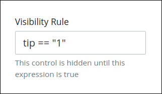
For example, this control displays if the variable value tip is 1. For a detailed example of the Visibility Rule setting, see Show or Hide Controls Based on Button Selection.
Note the following regarding how to use visibility rules:
To make this control hidden until another control contains a value, enter the Variable Name setting value of that control to this control's Visibility Rule setting.
Do not to use visibility rules with Email-type Screens. Some email clients that do not render natively from a web browser, such as Microsoft Outlook or Mozilla Thunderbird for the desktop, alter the HTML during rendering and may break visibility rules.
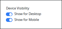
Device Visibility
Select on which device types this control displays:
Desktop: The control displays only on desktop devices. Enable the Show for Desktop toggle key.
Mobile: The control displays only on mobile devices. Enable the Show for Mobile toggle key.
Both: The control displays on both desktop and mobile devices. Both toggle keys are enabled by default.
CSS Selector Name
Enter the value to represent this control in custom CSS syntax when in Custom CSS mode. As a best practice, use the same CSS Selector Name value on different controls of the same type to apply the same custom CSS style to all those controls.
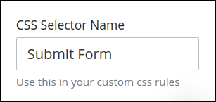
Then, use this name in the Custom CSS feature to apply CSS styling to this control as follows:
[selector='Submit Form'] {
    color: blueviolet;
}
See the following best practices regarding custom CSS in Screens:
Display-Type Screen Settings
The Record List control has the following configurable settings in the Properties Panel for Display-type Screens:
Variable Panel Settings
Expand the Variable panel from the Properties Panel on the right to configure the following properties:
Variable Name
Edit the default Variable Name setting value for this control if necessary. The Variable Name setting value represents data in this control during Requests. Ensure that the Variable Name setting value is a unique name from other controls in this Screen and contains at least one letter. This is a required setting.
Use the Variable Name setting value in the following ways:
Reference this control by its Variable Name setting's value.
Reference this control's value in a different Screen Builder control. To do so, use mustache syntax and reference this control's Variable Name value in the target control. Example:
{{ RecordListControl }}.Reference this value in Visibility Rule setting expressions.
See best practices when editing a Request variable name.
Columns Panel Settings
Follow these steps before configuring columns in this Record List control:
Save setting configurations in this Record List control if necessary.
While in Design mode, open the Screen that contains the Record List control that recorded the list.
Locate each control that corresponds with each specified column header. Each of these controls received a record data component when the record list was recorded in a Request. Make note of each control's Variable Name setting value, as you must provide this same value when configuring each column header in this Record List control.
Expand the Columns panel from the Properties Panel on the right.
See the following procedures how to configure the column header(s) that display the record list data and from which control(s) on the additional page in this Screen to reference data components of each record for this control.
Add a Column to This Record List Control
Follow these steps to add a column to this control:
Access the Columns panel for this control while in Design mode, and then locate the Column setting.
Ensure that the Column list label displays. If the JSON Data option displays, click the Edit as Option List option.
Click the icon
beside the Column label. The Add Column screen displays. In the Column Header setting, enter the column header label that displays in the record list. This column header represents a data component for each record in the record list.
In the Value setting, enter the Variable Name setting value for the control on the second page of this Screen that receives a data component for each record that corresponds with this column header. For example, use a Line Input control with a Variable Name setting value of
LineInputFirstNameto receive each person's first name for each record in the list, and then associate thatLineInputFirstNamevalue with a column header labeledFirst Name.Click Save. The column header displays in the Column list label.
Edit a Column Configuration in This Record List control
Follow these steps to add a column to this control:
Access the Columns panel for this control while in Design mode, and then locate the Column setting.
Ensure that the Column list label displays. If the JSON Data option displays, click the Edit as Option List option.
Click the
icon for a column to change its settings. The Edit Option screen displays. In the Column Header setting, edit the column header label that displays in the record list as necessary. This column header represents a data component for each record in the record list.
In the Value setting, edit the Variable Name setting value for the control on the second page of this Screen that receives a data component for each record that corresponds with this column header as necessary. For example, use a Line Input control with a Variable Name setting value of
LineInputFirstNameto receive each person's first name for each record in the list, and then associate thatLineInputFirstNamevalue with a column header labeledFirst Name.Click Update. The edited column displays below the Column list label.
Delete a Column from This Record List Control
Follow these steps to delete a column from in this control:
Access the Columns panel for this control while in Design mode, and then locate the Column setting.
Ensure that the Column list label displays. If the JSON Data option displays, click the Edit as Option List option.
Click the
icon for the column to be deleted from this control. A message displays to confirm deletion of the option.Click Delete.
Sort the Order of the Options
Follow these steps to sort the order of the columns that display in this control:
Access the Columns panel for this control while in Design mode, and then locate the Column setting.
Ensure that the Column list label displays. If the JSON Data option displays, click the Edit as Option List option.
Drag the
icon for each column up or down to sort the order they display in this control as necessary.
Add Columns to This Record List Control Using a JSON Schema
Follow these steps to add a column to this control using a JSON schema:
Access the Columns panel for this control while in Design mode, and then locate the Column setting.
Click the Edit as JSON option below the Column list label if this option does not currently displayed.
The JSON Data setting displays. If a valid JSON schema has been configured previously, the JSON Data setting displays the JSON. Otherwise the setting is empty.
Click the icon
beside the JSON Data option. The Script Config Editor displays. Enter your control columns in the order they are to display in this control using JSON format. Use the scroll panel to the right of the JSON to scroll to different sections of the JSON if necessary. This is useful especially when you are editing a long JSON.
Click Close or the Close icon
. The control columns are saved.
Design Panel Settings
Expand the Design panel from the Properties Panel on the right to configure the following properties:
Advanced Panel Settings
Expand the Advanced panel from the Properties Panel on the right to configure the following properties:
Visibility Rule
Specify an expression that indicates the condition(s) under which this control displays. See Expression Syntax Components for "Visibility Rule" Control Settings. If this setting does not have an expression, then this control displays by default.
For example, this control displays if the variable value tip is 1. For a detailed example of the Visibility Rule setting, see Show or Hide Controls Based on Button Selection.
Note the following regarding how to use visibility rules:
To make this control hidden until another control contains a value, enter the Variable Name setting value of that control to this control's Visibility Rule setting.
Do not to use visibility rules with Email-type Screens. Some email clients that do not render natively from a web browser, such as Microsoft Outlook or Mozilla Thunderbird for the desktop, alter the HTML during rendering and may break visibility rules.
Device Visibility
Select on which device types this control displays:
Desktop: The control displays only on desktop devices. Enable the Show for Desktop toggle key.
Mobile: The control displays only on mobile devices. Enable the Show for Mobile toggle key.
Both: The control displays on both desktop and mobile devices. Both toggle keys are enabled by default.
CSS Selector Name
Enter the value to represent this control in custom CSS syntax when in Custom CSS mode. As a best practice, use the same CSS Selector Name value on different controls of the same type to apply the same custom CSS style to all those controls.
Then, use this name in the Custom CSS feature to apply CSS styling to this control as follows:
[selector='Submit Form'] {
    color: blueviolet;
}
See the following best practices regarding custom CSS in Screens: