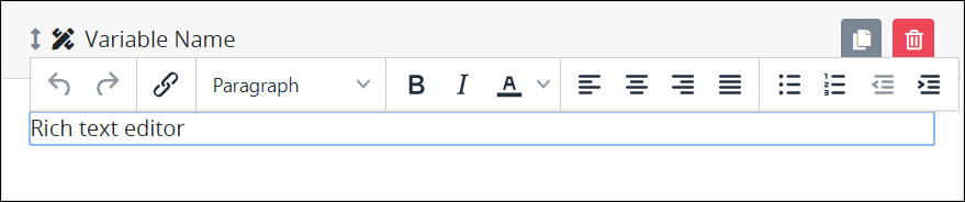
The Rich Text control displays HTML-formatted text and images. Use the What-You-See-Is-What-You-Get (WYSIWYG) editor to display a variety of text styles for the Request participant. Reference an image to display in the Rich Text control using HTML syntax. See a design example.
Aside from rich text styles and images, the Rich Text control can display the following information regarding in-progress Requests:
Request data: Display the value of another control in the same or different Screen by referencing that control's Variable Value setting value using mustache syntax: encapsulate the Variable Name setting value between
{{and}}that represent mustache syntax. In doing so, you are referencing Request data. Spaces surrounding the Request data reference are allowed. During the Request, the Rich Text control references the Request data to locate that control's value to display it in the Rich Text control.Include your own HTML syntax in the Rich Text control along with Request data references. Example:
Full Name: <p>{{ FullName }}</p>Magic Variable values: Display the value of a Magic Variable by referencing the Magic Variable using mustache syntax. Example:
{{ _user.fullname }}. Spaces surrounding the Magic Variable reference are allowed.
This control is available for all type of Screens. See Screen Types.
Watch the following product tour to learn how to use a Rich Text control.
For documented examples of using this control, see:
Add the Control to a Screen
Permissions
Your user account or group membership must have the following permissions to design a Screen unless your user account has the Make this user a Super Admin setting selected:
Screens: Edit Screens
Screens: View Screens
See the Screens permissions or ask your Administrator for assistance.
Follow these steps to add this control to the Screen:
From the Controls Menu on the left, expand the Content Fields category, and then locate the Rich Text icon
 .
.Drag and drop the control to the Screen Builder canvas. Existing controls in the Screen will adjust positioning based on where you drag the control.
Configure the Rich Text control. See Settings.
Validate that the control is configured correctly. See Validate Your Screen.
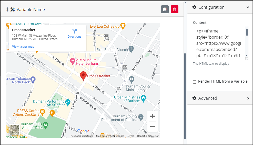
Below is a Rich Text control where you are embedding a map.
Settings
The Rich Text control has the following configurable settings in the Properties Panel:
Configuration Panel Settings
Expand the Configuration panel from the Properties Panel on the right to configure the following properties:
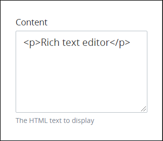
Content
Enter the text and/or image to display in the Rich Text control using HTML syntax (see a design example) and/or mustache syntax. Rich text editor paragraph is the default value. See this control's description for information how to use mustache syntax.
Alternatively, use the What-You-See-Is-What-You-Get (WYSIWYG) rich text editor to enter your text. Reference images in your content using HTML syntax. The WYSIWYG rich text editor also supports mustache syntax. Your text and/or images display in the Content setting using HTML syntax.
Ensure that all Rich Text controls implemented in a Conversational-type Screen contain content in their Content settings. See Controls in Conversational-Type Screens Require Labels.
Follow these guidelines to use the WYSIWYG rich text editor to stylize your text:
Undo changes: Click on the
 icon to undo the last action.
Redo changes: Click on the
 icon to redo the last undone action.
Insert/Edit links: Click on the
 icon to convert the selected text into a hyperlink. Follow these steps to create a hyperlink:
 Select the required text from the Rich Text control.
Click on the
icon. The Insert/Edit Link screen displays. 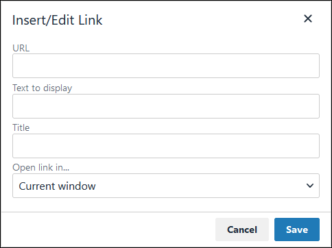
In the URL setting, enter the destination URL.
In the Text to display setting, edit or enter the text displayed in the Rich Text control.
In the Title setting, enter the text to display when a user hovers over the displayed text.
From Open link in… drop-down menu, select one of these options:
New window: Select this option to open the destination page in a new browser window.
Current window: Select this option to open the destination page in the current browser window.
Format text: Follow these guidelines to format text:
Headings: From the Formats menu, select Headings and then select a heading size.
Bold: Do one of the following:
From the editor toolbar, select the
 icon.
icon. From the Formats menu, select Inline and then Bold.
Italics: Do one of the following:
From the editor toolbar, select the
 icon.
icon. From the Formats menu, select Inline and then Italic.
Underline: From the Formats menu, select Inline and then Underline.
Strikethrough: From the Formats menu, select Inline and then Strikethrough.
Superscript: From the Formats menu, select Inline and then Superscript.
Subscript: From the Formats menu, select Inline and then Subscript.
Code: From the Formats menu, select Inline and then Code.
Paragraph: From the Formats menu, select Blocks and then Paragraph.
Blockquote: From the Formats menu, select Blocks and then Blockquote.
Division: From the Formats menu, select Blocks and then Div.
Preformatted: From the Formats menu, select Blocks and then Pre.
Change text color: Use the Text Color drop-down to change text color. Click on the
 icon. The color palette displays. Do one of the following:
 Select one of the color swatches from the color palette. The selected text changes to that color.
Click the
 icon to select a custom color from the Color Picker.
 Click the
 icon to reset the text to its default color.
Align text: Follow these guidelines to align text:
Left align: Do one of the following:
From the editor toolbar, use the
 icon to left- align text.
From the Formats menu, select Align and then Left.
Center align: Do one of the following:
From the editor toolbar, use the
 icon to center-align text.
From the Formats menu, select Align and then Center.
Right align: Do one of the following:
From the editor toolbar, use the
 icon to right-align text.
From the Formats menu, select Align and then Right.
Justify: Do one of the following:
From the editor toolbar, use the
 icon to justify text.
 From the Formats menu, select Align and then Justify.
Insert a bullet list: Use the
 icon to format text as a bulleted list.
Insert a numbered list: Use the
 icon to format text as a numbered list.
Indent text: Click on the
 icon to increase text indenting.
Outdent text: Click on the
 icon to decrease text indenting.
Content Example
Use the HTML language syntax when embedding media such as add videos, images, or iframes. For example, enter the following code to embed a map:
<p><iframe style="border:0;" src="https://www.google.com/maps/embed?pb=!1m18!1m12!1m3!1d3228.0344022463764!2d-78.90347352339937!3d35.9950260126713!
2m3!1f0!2f0!3f0!3m2!1i1024!2i768!4f13.1!3m3!1m2!1s0x89ace59f020e12ff%3A0x8eb6ce579282f45e!2sProcessMaker!5e0!3m2!1sen!2sbo!4v1719413473879!5m2!1sen!
2sbo" width="600" height="450" allowfullscreen="" loading="lazy"></iframe></p>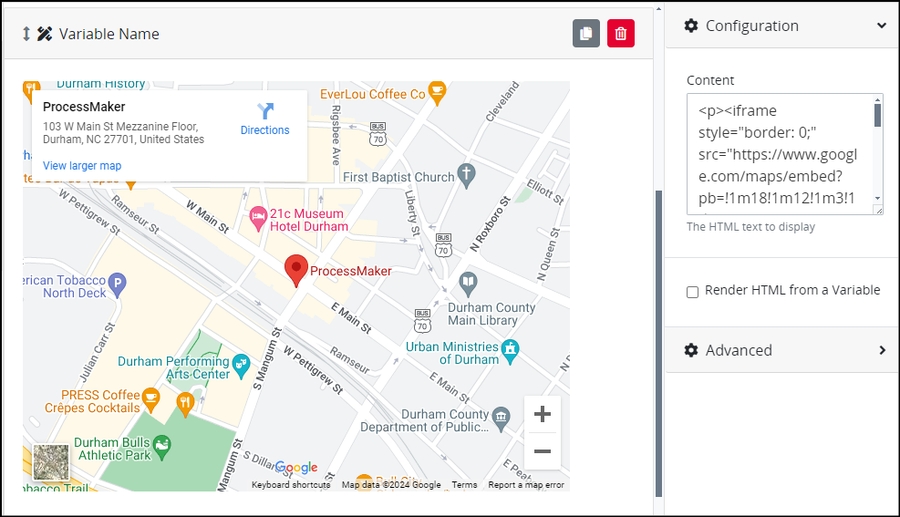
Best Practice for Custom CSS in Email Screens
When designing Email Screens with Rich Text controls, avoid relying on general HTML tag selectors (e.g.,
p { color: red; }) in your CSS. Many email clients—like Gmail or Outlook—strip or override these styles for security and rendering consistency. As a best practice, use inline CSS on HTML elements such as<p style="color:blue;">.
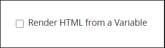
Render HTML from a Variable
Select the Render HTML from a Variable setting to not show HTML syntax, but instead render the HTML syntax. If the Render HTML from a Variable setting is not selected, then the Rich Text control displays the HTML syntax. If a Request variable from which the Rich Text control references its data contains HTML syntax, select this setting to render that HTML.
Advanced Panel Settings
Expand the Advanced panel from the Properties Panel on the right to configure the following properties:
Visibility Rule
Enter an expression that indicates the condition(s) under which this control displays. See Expression Syntax Components. If this setting does not have an expression, then this control displays by default.
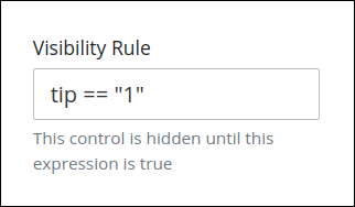
For example, this control displays if the variable value tip is 1. For a detailed example of the Visibility Rule setting, see Show or Hide Controls Based on Button Selection.
Note the following regarding how to use visibility rules:
To make this control hidden until another control contains a value, enter the Variable Name setting value of that control to this control's Visibility Rule setting.
Do not to use visibility rules with Email-type Screens. Some email clients that do not render natively from a web browser, such as Microsoft Outlook or Mozilla Thunderbird for the desktop, alter the HTML during rendering and may break visibility rules.
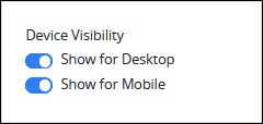
Device Visibility
Select on which device types this control displays:
Desktop: The control displays only on desktop devices. Enable the Show for Desktop toggle key.
Mobile: The control displays only on mobile devices. Enable the Show for Mobile toggle key.
Both: The control displays on both desktop and mobile devices. Both toggle keys are enabled by default.
CSS Selector Name
Enter the value to represent this control in custom CSS syntax when in Custom CSS mode. As a best practice, use the same CSS Selector Name value on different controls of the same type to apply the same custom CSS style to all those controls.
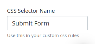
Then, use this name in the Custom CSS feature to apply CSS styling to this control as follows:
[selector='Submit Form'] {
    color: blueviolet;
}
See the following best practices regarding custom CSS in Screens: