The Select List control provides either a checkbox- or multi-select drop-down menu-style control from which the Request participant selects one or more options.
Set options that display in this control in one of the following ways:
Provide each option: For each option, enter a unique value that represents the option, and then enter the text that displays as the option. After your options are configured, sort the order in which they are to display in the control. Alternatively, provide options in the control in JSON format.
Reference data in a Request Variable: Reference data from the in-progress Request as options in this control. This data object must be part of the Request's JSON data model.
Reference a data source in the JSON data model: Reference data from a Data Connector that displays in this control as its options. Specify the data name, value, and content from the Data Connector. See a design example. Optionally, use a PMQL expression to limit which data to use as options based on the PMQL expression's criteria. The order that data objects present in the data object determines the order these options display in the control; options cannot be manually reordered.
Reference data in a Collection: Reference data from a Collection and display it as options in this control. Optionally, use a PMQL expression to filter the displayed options in real-time.
This control is only available for the following Screen types:
Conversational-type
Form-type
See Screen Types.
For documented examples of using this control, see:
Dependent Select List Controls Display Countries and Regions from a Collection.
Dependent Select List Controls Display Countries and Regions Using Two Data Connectors
Checkbox Functional Description
When using the Select List control with checkboxes, the control functions similarly to multiple Checkbox controls whereby multiple options may be selected. Unlike using multiple Checkbox controls, the Select List control includes all selected options as an array in the order that options are selected. This array becomes part of the JSON data model as shown in the example below in Preview mode.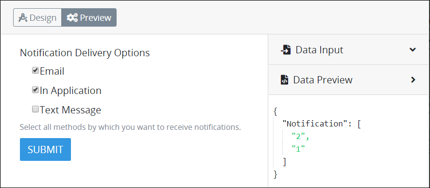
Drop-Down Menu Functional Description
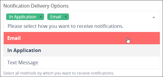
When using the Select List control as the drop-down menu, multiple options may be selected one at a time. Selected options have the following attributes:
Each selected option displays in the control.
Each selected option displays in bold-style text in the drop-down menu. Furthermore, a red-colored highlight displays when hovering over a selected option, rather than the default green-colored highlight for deselected options.
Follow these guidelines to deselect an item from the Select List control when using the drop-down menu style:
Click the image
 for the option to be removed.
Select the option again from the drop-down menu.
The Select List control includes all selected options as an array in the order that options are selected. This array becomes part of the JSON data model as shown in the example below in Preview mode.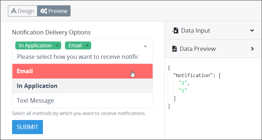
Add the Control to a Screen
Permissions
Your user account or group membership must have the following permissions to design a Screen unless your user account has the Make this user a Super Admin setting selected:
Screens: Edit Screens
Screens: View Screens
See the Screens permissions or ask your Administrator for assistance.
Follow these steps to add this control to the Screen:
Create a new Form-type or Conversational-type Screen or edit an existing one.
From the Controls Menu on the left, expand the Input Fields category, and then locate the Select List icon
 .
.Drag and drop the control to the Screen Builder canvas. Existing controls in the Screen will adjust positioning based on where you drag the control.
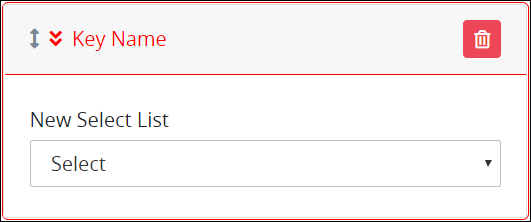
Configure the Select List control. See Settings.
Validate that the control is configured correctly. See Validate Your Screen.
Below is a Select List control where you can select a method to receive notifications.
Settings
The Select List control has the following configurable settings in the Properties Panel:
Variable Panel Settings
Expand the Variable panel from the Properties Panel on the right to configure the following properties:
Variable Name
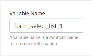
Edit the default Variable Name setting value for this control if necessary. The Variable Name setting value represents data in this control during Requests. Ensure that the Variable Name setting value is a unique name from other controls in this Screen and contains at least one letter. This is a required setting.
Use the Variable Name setting value in the following ways:
View the selection made in this control by its Variable Name setting's value. The Data Preview panel in Preview mode corresponds the option(s) the Request participant selects in the Select List control with that Select List control's Variable Name value. The Variable Name setting contains the selected option(s) as an array. In the example below,
form_select_list_1is the Variable Name setting's value.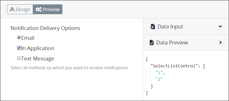
Reference this value in Visibility Rule setting expressions.
Reference a property from the selected value when the Select List control is of type
objectin the current Screen or with a Nested Screen control. To do so, first reference this control's Variable Name value in a Calculated Property, then use this Calculated Property in the target control. As a best practice, do not directly reference the Variable Name setting of a Select List control.
Example
Consider the following example. A Select List control with Variable Name setting value account displays a list of accounts available at your bank.
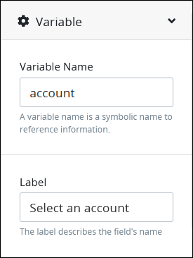
When a user makes a selection, you want to display the selected account in a Line Input control on this Screen. Use the following best practice to reference the value of the Select List control.
Insert a Line Input control and set its Variable Name value. This example uses the Variable Name value
AccountName.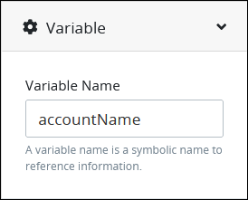
Create a Calculated Property and set the Property Name setting to
accountName.In the JavaScript setting, enter the following JavaScript code:
if (!this.account) {
    // if no account was selected return null
    return null;
}
return this.account.name;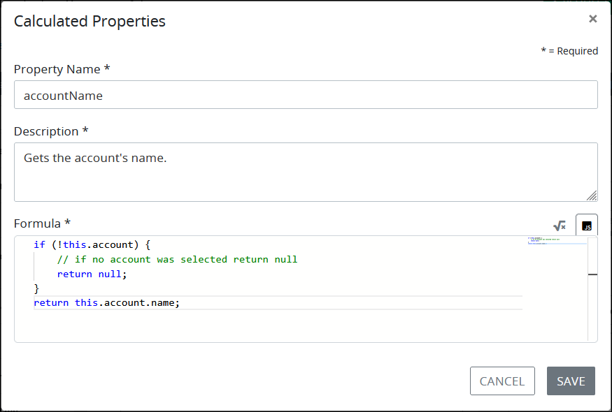
See best practices when editing a Request variable name.
Label
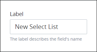
Edit the default label that displays for this control if necessary. New Select List is the default value.
Ensure that all Select List controls implemented in a Conversational-type Screen contain Label setting values. See Controls in Conversational-Type Screens Require Labels.
Validation Rules
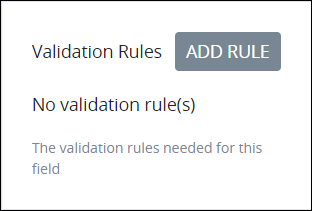
Enter the validation rule(s) the Request participant must comply with to properly enter a valid value into this control. This setting has no default value. If there are no configured validation rules the following message displays: No validation rule(s). See Validation Rules for "Validation" Control Settings.
Follow these steps to add a validation rule to this control:
Access the Variable panel for this control while in Design mode, and then locate the Validation Rules setting.
Click the Add Rule button. The Select drop-down menu displays.
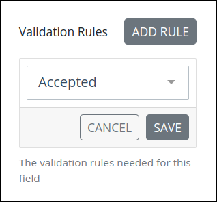
Select the rule that this control validates against.
Click Save. Parameters for the selected rule display. Parameter settings display which ones are required to properly configure the rule.
Enter the parameter settings that this control uses to validate against. See Validation Rule Settings, and then locate the validation rule for its parameters.
Follow these steps to edit a validation rule for this control:
Access the Variable panel for this control while in Design mode, and then locate the Validation Rules setting.
Click the Edit icon
 for the validation rule to edit if that rule can be edited. Validation rules that do not have parameters cannot be edited. The parameter settings for that validation rule displays.
Edit the parameter settings that this control uses to validate against. See Validation Rule Settings, and then locate the validation rule for its parameters.
Follow these steps to delete a validation rule for this control:
Access the Variable panel for this control while in Design mode, and then locate the Validation Rules setting.
Click the Delete icon
 for the validation rule to delete. A message displays to confirm deletion of the validation rule.
Click Delete.
Make Required
Select to indicate that this control is required. This option is not selected by default. This is a quick way to add the Required validation rule.

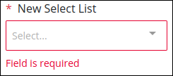
In the Screen preview or during a Request, the control displays with a red-colored asterisk. If you submit the Screen without selecting this required Checkbox, this control displays Field is required in red-colored text.
Read Only
Select to indicate that this control cannot be edited. This option is not selected by default.

Configuration Panel Settings
Expand the Configuration panel from the Properties Panel on the right to configure the following properties:
Placeholder Text
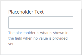
Enter the placeholder text that displays in this control when no value has been provided. This setting has no default value.
Helper Text
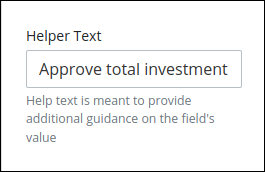
Enter text that provides additional guidance on this control's use. This setting has no default value.
Data Source Panel Settings
Expand the Data Source panel from the Properties Panel on the right to select one of the following methods to specify options that display in the Select List control:
Provide options: Enter a unique value that represents each option, and then enter the text that displays as the option. After your options are configured, sort the order in which they are to display in this control. Alternatively, provide options in this control in JSON format.
Request data: Reference data from the in-progress Request as options in this control. This data object must be part of the Request's JSON data model. During the in-progress Request, the Select List control references a specified data array and object in the Request's JSON data model to display its values as options in that control. The order that data objects are in the Request's JSON data model determines the order these options display in the control; options cannot be manually reordered. See the following related topics:
Data Connector: Reference the data from a Data Connector's Endpoint as options in this control. These Endpoints a Data Connector references may be Application Program Interface (API) endpoints, Collection records, or other data source endpoints. During the in-progress Request, when the Select List control references data from the Data Connector, the control maps the Data Connector data to a specified JSON data array, variable or key name, or data object to become part of that Request's data. Data maps to the JSON data array in the same order it is retrieved from the Data Connector. Optionally, use a PMQL expression to limit which data to use as options based on the PMQL expression's criteria. The order that data objects return from the Data Connector determines the order these options display in the control; options cannot be manually reordered.
See Example: Dependent Select List Controls Display Countries and Regions.
Collection: Reference data saved in a Collection and display records from a Collection column. Optionally, use a PMQL expression to limit which data to use as options based on the PMQL expression's criteria. For an example, see Example: Dependent Select List Controls Display Countries and Regions from a Collection.
Provide Options
See the following procedures how to provide options for a Select List control.
Add an Option
Follow these steps to add an option that displays in this control using Screen Builder:
Access the Data Source panel for this control while in Design mode, and then locate the Data Source setting.
From the Data Source drop-down menu, select Provide Values if this setting is not selected. This is the default setting.
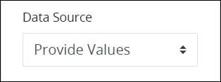
Ensure that the Options list label displays. If the JSON Data option displays, click the Edit as Option List option.

Click the icon
 beside the Options list label. The Add Option screen displays.
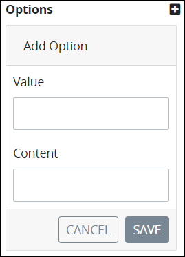
In the Value setting, enter a value to represent the option in the Request data. This value must be unique from other values in this control. If the value is not unique to other Value settings in this control, the following message displays: An item with the same key already exists.
In the Content setting, enter the option that displays in this control.
Click Save. The option displays below the Options list label.

Edit an Option
Follow these steps to edit an option that displays in this control using Screen Builder:
Access the Data Source panel for this control while in Design mode, and then ensure that the Data Source setting uses the Provide Values option.

Ensure that the Options list label displays. If the JSON Data option displays, click the Edit as Option List option.
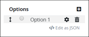
Click the
 icon for an option to edit its settings. The Edit Option screen displays.
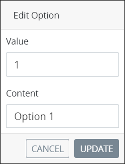
In the Value setting, edit the value to represent the option in the JSON data model during in-progress Requests for Processes that use this Screen as necessary. This value must be unique from other values in this control. If the value is not unique to other Value settings in this control, the following message displays: An item with the same key already exists.
In the Content setting, edit the option that displays in this control as necessary.
Click Update. The edited option displays below the Options list label.
Delete an Option
Follow these steps to delete an option from in this control using Screen Builder:
Access the Data Source panel for this control while in Design mode, and then ensure that the Data Source setting uses the Provide Values option.

Ensure that the Options list label displays. If the JSON Data option displays, click the Edit as Option List option.

Click the
 icon for the option to be deleted from this control. A message displays to confirm deletion of the option.
Click Delete.
Sort the Order of the Options
Follow these steps to sort the order of the options that display in this control using Screen Builder:
Access the Data Source panel for this control while in Design mode, and then ensure that the Data Source setting uses the Provide Values option.

Ensure that the Options list label displays. If the JSON Data option displays, click the Edit as Option List option.

Drag the
 icon for each option up or down to sort the order they display in this control as necessary.
Provide Options Using a JSON Schema
Follow these steps to provide options that display in this control using a JSON schema:
Access the Data Source panel for this control while in Design mode, and then locate the Data Source setting.
From the Data Source drop-down menu, select Provide Values if this setting is not selected. This is the default setting.

Click the Edit as JSON option below the Options list label. If the JSON Data setting displays, skip this step.

The JSON Data setting displays. If a valid JSON schema has been configured previously, the JSON Data setting displays the JSON. Otherwise, this setting is empty.
Click the icon
 beside the JSON Data option. The Script Config Editor displays.
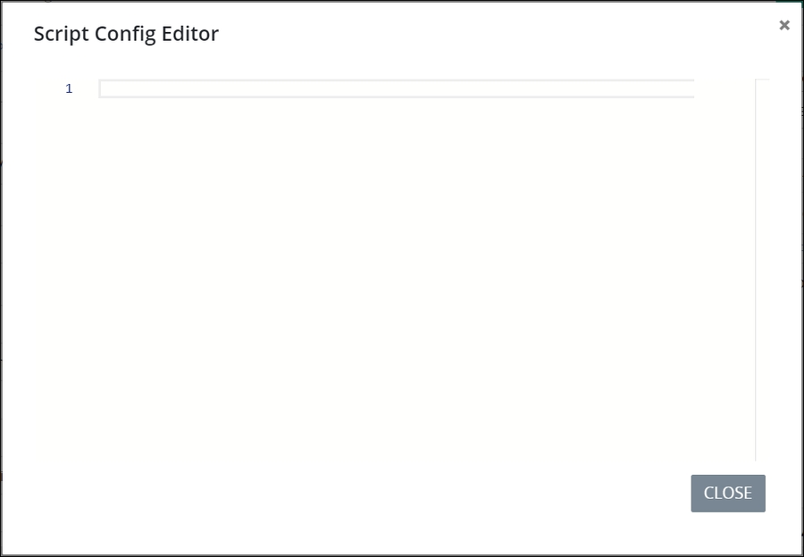
Enter your control options in the order they are to display in this control using JSON format. Use the scroll panel to the right of the JSON to scroll to different sections of the JSON if necessary. This is useful especially when you are editing a long JSON.
Click Close or the Close icon
 . The control options are saved.
How Options Display
Follow these steps to set how the options display:
Access the Data Source panel for this control while in Design mode, and then ensure that the Data Source setting uses the Provide Values option.

Click the Allow multiple selections setting to allow multiple options to be selected from this control. Otherwise, only one option can be selected.

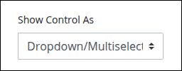
From the Render Options As drop-down menu, select one of the following options:
Dropdown/Multiselect: Select the Dropdown/Multiselect option to display the control as a drop-down menu.
Radio/Checkbox Group: Select the Radio/Checkbox Group option to display the control as a group of checkboxes.
Set to Allow Multiple Selections
Follow these steps to set whether multiple selections can be selected from this control:
Access the Data Source panel for this control while in Design mode, and then ensure that the Data Source setting uses the Provide Values option.

Click the Allow multiple selections setting to allow multiple options to be selected from this control. Otherwise, only one option can be selected.

Best Practice When Configuring a Select List Control Within a Loop Control
Make note of best practices when configuring a Select List control's options when that control is within a Loop control. When referencing a JSON array from a data source, configure the Select List control to reference the JSON object containing the JSON array and not its values. Then duplicate the JSON array in the Loop control. See Duplicate the JSON Array in a Select List Control Used in a Loop Control.
Best Practice When Editing a Collection Using a Select List Control in a Loop Control
Make note of best practices when editing a Collection record using a Select List control in a Loop control, configure the Select List control's Type of Value Returned setting with the Single Value option. See Use Single Value instead Object in a Select List.
Make note of practices to avoid when referencing Request data for the options in a Select List control.
Reference Request Data
Follow these steps to reference data from the in-progress Request as options in this control:
Access the Data Source panel for this control while in Design mode.
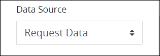
From the Data Source drop-down menu, select Request Data.
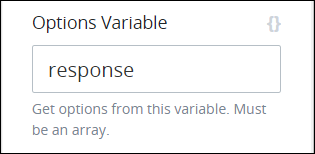
In the Options Variable setting, enter from which Request variable, based on its Variable Name setting value, to use as options for this control. The Request variable from which to use as options must be an array. The options in the Select List control display in the same order as the Request variable lists items in its array. Optionally, use mustache syntax to indicate the Request variable name, especially if each option in this control derives from combining multiple properties within an array where each of its items contains one or more objects. response is the default setting. See Dependent Field Design Example Using Select List Controls.
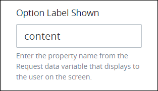
In the Option Label Shown setting, enter the JSON object key name from within the JSON array containing the Request variable from which to display as each option in this control. To use all JSON object key names in the JSON object, do not enter a value into the Option Label Shown setting. Use JSON dot notation as necessary.
For example, consider the following JSON array within Request data named
accountTypesthat contains two JSON objects, both of which their key names aretype:"accountTypes": [{"type": "Life"},{"type": "Medical"}]To reference both values from the key name
typeas options in the Select List control, use the following JSON dot notation in the Option Label Shown setting:data.accountTypes. The JSON array must contain JSON objects composed of key names and corresponding values, not just values like the following:"accountTypes": ["Life", "Medical"]Optionally, use mustache syntax to indicate the JSON object key name from within the JSON array. content is the default value.
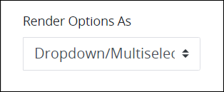
From the Show Control As drop-down menu, select one of the following options:
Dropdown/Multiselect: Select the Dropdown/Multiselect option to display the control as a drop-down menu.
Radio/Checkbox Group: Select the Radio/Checkbox Group option to display the control as a group of checkboxes.
Select the Allow multiple selections option to allow multiple options to be selected from this control. Otherwise, only one option can be selected.

From the Type of Value Returned drop-down menu, select one of the following options:
Single Value: Select the Single Value option to indicate that only a part of the JSON object specified from the Option Label Shown displays as each option in this control. As a best and general practice, use single-value JSON objects.
Object: Select the Object option to indicate that the entire JSON object within each item of the array displays as each option in this control.
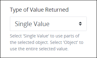
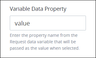
If the Single Value option from the Type of Value Returned setting is selected, the Variable Data Property setting displays. In the Variable Data Property setting, enter the JSON object key name from within the JSON array containing the JSON response that this control stores in that Request's data when this Screen submits. To use all items in the JSON array, do not enter a value into the Variable Data Property setting. Use JSON dot notation as necessary if the relevant JSON array containing the object key name is embedded in other JSON objects and/or arrays. Optionally, use mustache syntax to indicate the JSON key name from within the JSON array. value is the default value. See Dependent Field Design Example Using Select List Controls.
Reference a Data Connector
Follow these steps to reference data from a Data Connector as options in this control:
Access the Data Source panel for this control while in Design mode.
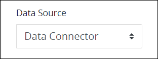
From the Data Source drop-down menu, select Data Connector.
In the Options Variable setting, enter the name of the JSON array containing the API's JSON response from which to reference its objects as options that display in this control after the Data Connector's Resource interacts with the API endpoint. The name of the JSON array is called
responseby default. Use JSON dot notation as necessary if the relevant JSON array containing the object key name is embedded in other JSON objects and/or arrays. response is the default value.
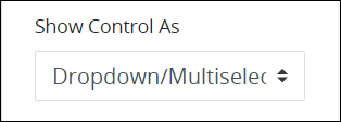
From the Show Control As drop-down menu, select one of the following options:
Dropdown/Multiselect: Select the Dropdown/Multiselect option to display the control as a drop-down menu.
Radio/Checkbox Group: Select the Radio/Checkbox Group option to display the control as a group of checkboxes.
Select the Allow multiple selections option to allow multiple selections from this control. Otherwise, only one option can be selected.

From the Type of Value Returned drop-down menu, select one of the following options:
Single Value: Select the Single Value option to indicate that only a part of the JSON object specified from the Option Label Shown displays as each option in this control.
Object: Select the Object option to indicate that the entire JSON object within each item of the array displays as each option in this control.

If the Single Value option from the Type of Value Returned setting is selected, the Value setting displays. In the Value setting, enter the JSON object key name from within the JSON array containing the JSON response that this control stores in that Request's data when this Screen submits. To use all items in the JSON array, do not enter a value into the Value setting. Use JSON dot notation as necessary if the relevant JSON array containing the object key name is embedded in other JSON objects and/or arrays. Optionally, use mustache syntax to indicate the JSON key name from within the JSON array. value is the default setting. See Dependent Field Design Example Using Select List Controls.
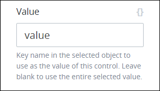
In the Content setting, enter the JSON object key name from within the JSON array containing the JSON response to display as each option in this control. To use all JSON object key names in the JSON object, do not enter a value into the Content setting. Use JSON dot notation as necessary. Optionally, use mustache syntax to indicate the JSON object key name from within the JSON array.
content is the default value.
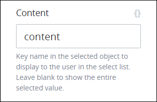
From the Data Connector drop-down menu, select from which Data Connector to reference as a data source. If a Data Connector does not exist, this setting has no options.
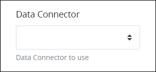
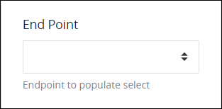
From the End Point drop-down menu, select which Resource to reference from the selected Data Connector. A Resource is a Data Connector asset with which to interact with a data source, also called an End Point. These Resources are configured from the Data Connector itself. Depending on the Data Connector selected from the Data Connector Name drop-down menu, these Resources may reference Application Program Interface (API) endpoints, Collection records, or other data source endpoints.
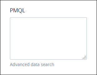
In the PMQL setting, optionally enter a PMQL expression to filter which data in the JSON data array to display as options in this control based on which JSON objects in that array meet the PMQL expression's criteria.
Consider the following example of doctors who work in a clinic.
doctors = [
    {id: 1, name: 'Adam Ardin', gender: 'male'},
    {id: 2, name: 'Amanda Creek', gender: 'female'},
    {id: 3, name: 'Lucy Morales', gender: 'female'},
    {id: 4, name: 'Mindy Smith', gender: 'female'},
    {id: 5, name: 'Toby Tomlinson', gender: 'male'}
]
Use the following settings to reference this data array as options for this control:
Element Name:
doctorsValue:
idContent:
name
Suppose that a new patient at the clinic indicates that she wants to see a female doctor. To filter doctors from this JSON data array who are female in the clinic so that only those objects display as options in a Select List control, use the following PMQL expression in the PMQL setting of that control:
gender = "female"
Reference a Collection
Follow these steps to reference data from a Collection as options in this control:
Access the Data Source panel for this control while in Design mode.
From the Data Source drop-down menu, select Collection.

From the Collection drop-down menu, select the name of the Collection from which to retrieve data.

From the Label drop-down menu, select the name of the Collection column that contains the data to be displayed as options in the Select List control.

From the Value drop-down menu, select the name of the Collection column that contains the data to be saved into Request data when a user makes a selection.

The Label and Value drop-down menus can have the same or different Collection columns selected. Consider an example of a Collection with columns
City NameandZip Code. The Select List control can be configured in the following ways:Selecting
City Namein Label and Value displays the name of all cities in the Select List control and save the name of the selected city in Request data.Selecting
City Namein Label andZip Codein Value, displays a list of cities, but saves the Zip Code of the selected city in Request data.
In the PMQL setting, optionally enter a PMQL expression to filter the data being retrieved from the Collection. If a filter criteria is specified here, the Select List control dynamically filters in real-time based on the specified PMQL expression.

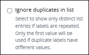
Select the Ignore duplicates in list option to display repeating data only once in the Select List control.
See Example: Dependent Select List Controls Display Countries and Regions from a Collection.
Design Panel Settings
Expand the Design panel from the Properties Panel on the right to configure the following properties:
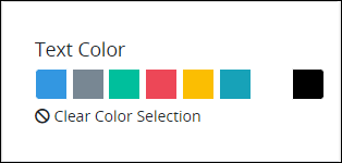
Text Color
Select the text color that displays for this control. Optionally, click the Clear Color Selection option to remove the selected color.
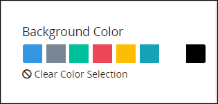
Background Color
Select the background color that displays for this control. Optionally, click the Clear Color Selection option to remove the selected color.
Advanced Panel Settings
Expand the Advanced panel from the Properties Panel on the right to configure the following properties:
Default Value
Enter the default value this control displays. The default value can be assigned as a Request variable, text or JavaScript. When the Screen submits, the Request uses this control's default value unless the Request participant changes it. When using a Request variable in the Default Value setting, consider the following:
If the Request variable is empty, the control does not display any value by default.
When the Request variable is assigned a value for the first time, this value becomes the permanent default value of the control.
Any further changes to the Request variable do not affect the default value of the control.
The Default Value setting supports using Request variables in mustache syntax. For example, if the Default Value setting is {{ FirstName }} {{ LastName }} from which a Request participant entered her first name and last name in separate controls (respectively) earlier in that Request, this control displays the contents of those controls by default during the Request.
There are two ways to enter the default value this control displays.
Default Value As A Text
Enter the default value as text or a Request variable in mustache syntax.
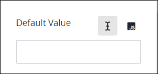
When the Select List control is configured with Provide Options, the Default Value setting compares numerical values as a string.
If the Select List is configured with Provide Options Using a JSON Schema, take care to enclose the numerical values in quotation marks (such as "1") because this can cause errors when comparing against the Default Value setting value.
[
    {
        "value": "1",
        "content": "Joyce"
    },
    {
        "value": "2",
        "content": "Natty"
    },
    {
        "value": "3",
        "content": "Franny"
    },
    {
        "value": "4",
        "content": "Beatty"
    },
]
If you need to compare default values other than a String-type value, enter the default value using JavaScript.
Default Value As A Script
Enter the default value as JavaScript, especially if a Calculated Property might change this default value setting. Ensure to use the this. JavaScript keyword preceding the Screen control reference. Example: this.FullName when FullName is the Variable Value setting value for the control to set its default value.
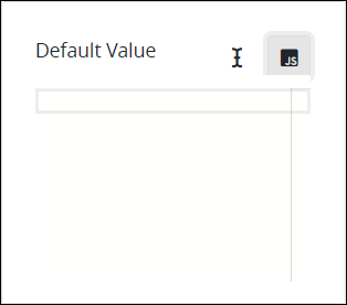
As opposite to the default setting, the JavaScript setting accepts values different to a String. Then if the Select List is configured with Provide Options Using a JSON Schema, then enter the Default Value as in the JSON schema. For example enter return 2;if the JSON values are integers like:
[
    {
        "value": 1,
        "content": "Joyce"
    },
    {
        "value": 2,
        "content": "Natty"
    },
    {
        "value": 3,
        "content": "Franny"
    },
    {
        "value": 4,
        "content": "Gan"
    },
]
Visibility Rule
Specify an expression that indicates the condition(s) under which this control displays. See Expression Syntax Components. If this setting does not have an expression, then this control displays by default.
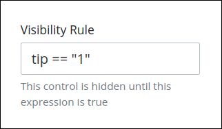
For example, this control displays if the variable value tip is 1. For a detailed example of the Visibility Rule setting, see Show or Hide Controls Based on Button Selection.
Note the following regarding how to use visibility rules:
To make this control hidden until another control contains a value, enter the Variable Name setting value of that control to this control's Visibility Rule setting.
Device Visibility
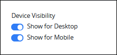
Select on which device types this control displays:
Desktop: The control displays only on desktop devices. Enable the Show for Desktop toggle key.
Mobile: The control displays only on mobile devices. Enable the Show for Mobile toggle key.
Both: The control displays on both desktop and mobile devices. Both toggle keys are enabled by default.
CSS Selector Name
Enter the value to represent this control in custom CSS syntax when in Custom CSS mode. As a best practice, use the same CSS Selector Name value on different controls of the same type to apply the same custom CSS style to all those controls.
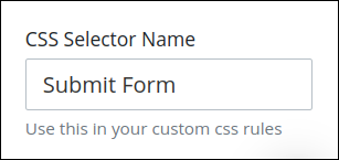
Then, use this name in the Custom CSS feature to apply CSS styling to this control as follows:
[selector='Submit Form'] {
    color: blueviolet;
}
See the following best practices regarding custom CSS in Screens:
Accessibility Panel Settings
The Accessibility panel centralizes settings that enhance screen-reader compatibility and overall usability. ARIA Label setting persists through import, copy/paste, versioning, and upgrades, supporting a more inclusive and standards-aligned Screen Builder experience.
Aria Label
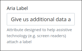
Enter the string that provides a text alternative to this control for the following purposes:
Assistive technology, such as screen readers, read the Aria Label setting value.
This control has a visual indication of its purpose, such as a control that uses a graphic instead of text, but still needs to clarify that purpose for anyone who cannot access the visual indication.
The Aria Label setting value replaces the Label setting value. For example, if a control has both a Label setting value and an Aria Label setting value, assistive technology only uses the Aria Label setting value.
Tab Order
Tab order determines the sequential navigation order to navigate a Screen's controls using a keyboard interface. Assistive technology users often use a keyboard for navigation.
See best practices for setting the tab order for a Screen's controls.
Enter the number for the sequential keyboard navigation order that this control takes focus amongst other controls in this Screen.
