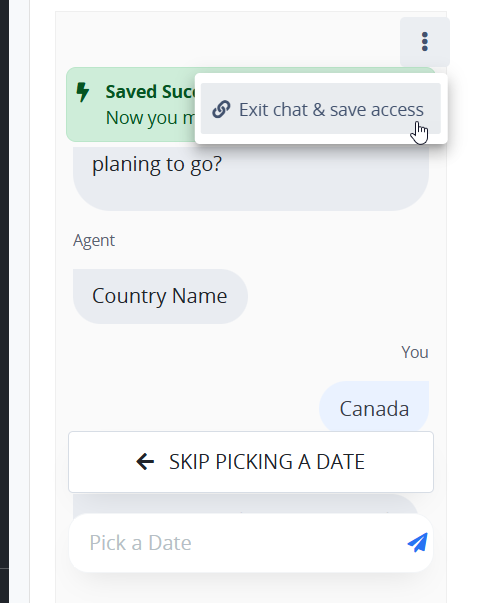
Conversational screens enable the creation of interactive, chat-style forms that guide users through a series of questions and responses. Each screen control is presented as a conversational prompt, to which the user can respond, enhancing engagement and interaction.
Screen controls are shown one at a time, creating a natural flow as users progress through the form.
Variables can be used to save user input during the conversation.
In-line actions and breakpoints enable a rule-based, advanced chat experience.
Conversational screens can be embedded into third-party sites using Web Entry to provide visitors with an automated chat-style interaction.
What’s new in Winter 2025
Optimized for a seamless experience on any device.
Advanced controls such as image/file upload with previews, date picker and select list controls are now available.
In-line actions and enhanced navigation options through breakpoints.
Integration with data connectors, decision tables, FlowGenie, and scripts.
Conversational Screens can be used with Web Entry, allowing integration into any third-party site, such as company websites, or support portals. These screens can be accessed by authenticated users or anonymous visitors. For more information see, Deploying Conversational Screens Using Web Entry.
Create a Conversational Screen
Follow these steps to create a new Conversational:
Click the +Screen button to create a new screen.
From the Screen Type drop-down menu, select Conversational.
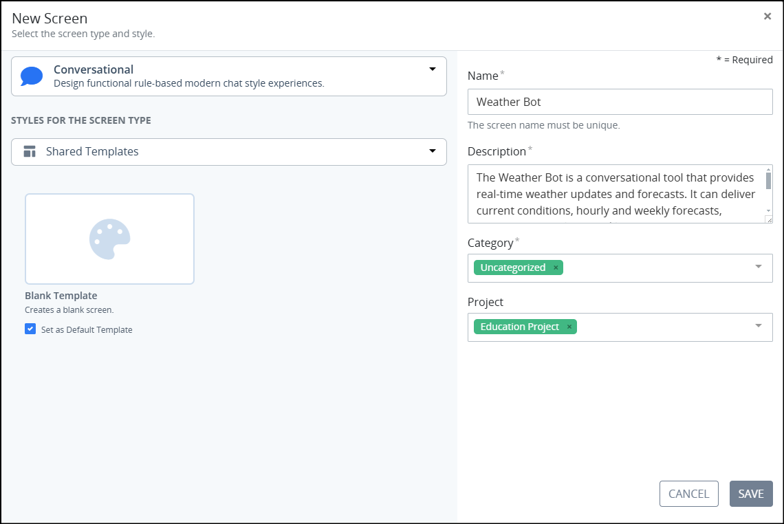
In the Name setting, enter a unique name for the Screen. Screen names can only consist of alphanumeric characters, apostrophes ('), and spaces.
In the Description setting, enter a description for the Screen.
From the Category drop-down menu, select one or more categories to associate with this Screen.
From the Project drop-down menu, optionally select the Project(s) for this screen. Only Projects where you are a member will be displayed.
Click Save. Screens Builder displays the new screen in design mode.
Build the screen using the controls available in the Controls Menu on the left. For more information, see Screen Builder.
Use the Preview button to test the screen.
When the design is complete, use the Publish button to make it available for use in processes.
Supported Screen Controls
Conversational Screens can be built using a number of controls that support a modular build of the Conversational Screens. This allows both the request data and the validation and visibility rules within each screen to shape the flow of the automated chat. This approach enables highly customizable and adaptive conversations that respond to user inputs and context within the current session.
Conversational Screens support the following controls:
Content Fields
Navigation
Files
Advanced
Screen Design Guidelines
Design each Conversational Screen as a modular component, keeping the overall conversational outcome in focus. For instance, prompt the participant for a response by asking a question and presenting options using a Select List control.
Use the Jump and Break controls to evaluate the flow of the conversation based on user input and jump to a certain breakpoint in the screen.
Use variables to incorporate previous responses into the automated conversation.
For example,How may I help you today, {{ Name }}?.Use validation rules to ensure the participant enters responses within the parameters of the conversation you expect.
Use visibility rules to indicate which control(s) display based on user input.
Process Design Guidelines
Use a Web Entry Start event to initiate the chat from a hosting site.
Use Web Entry in Form Tasks to incorporate Conversational Screens within a case.
Link multiple Conversational Screen tasks using Interstitial Screens to allow for seamless conversation.
When using Web Entry for Form Tasks, participants can use the Exit Chat and Copy Access option to save the conversation state, ensuring it is safe to close without losing information.
This action copies a link to the participant’s clipboard, allowing them to return to the chat later.
Important:
Participants should manually save the link to ensure they can reference it in the future.
The save chat option is not available for Web Entry Start Events.
Deploy Conversational Screens Using Web Entry
Use the Web Entry setting of a Start Event or a Form Task to allow participants to initiate an automated chat-style conversation through a URL. Web Entry provides the following benefits:
Embed JavaScript into your Web server's or blog's HTML header that contains the Web Entry URL to start the chat from a hosting site.
Both anonymous or authenticated users may start the chat, thereby potentially allowing anyone to contact your organization via the automated chat.
Follow these guidelines to configure Conversational Screens with Web Entry in a Start Event:
Select the Start Event element from the process model.
Click the
 icon to view the Configuration panel, and expand the Web Entry settings.
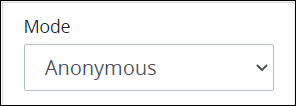
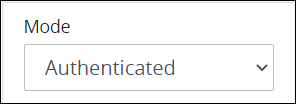
 From the Mode drop-down menu, select one of the following options:
Anonymous: Select the Anonymous option to allow any person who has access to the Web Entry's URL to access the screen.
Authenticated: Select the Authenticated option to require an authenticated user or group member to access the screen.
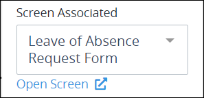
From the Screen Associated drop-down menu, select a Conversational Screen.
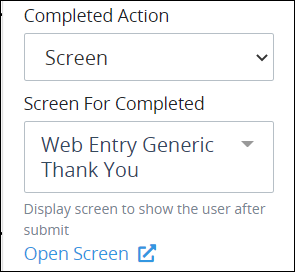
From the Completed Action drop-down menu, select one of the following options:
Screen: Select the Screen option to indicate that a Screen displays after the user submits the task.

From the Screen For Completed drop-down menu, select the Screen to display after task submission. This drop-down menu displays only Display types to display a message to the user.
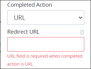
URL: Select the URL option to redirect the user to a URL after task submission.

In the Redirect URL setting, enter the redirection URL. The redirect URL setting supports mustache syntax to reference the value of a variable as the URL.
If the Anonymous option is selected from the Mode setting, the Enable Password Protect setting displays.

Select the Enable Password Protect setting to require a password to access the Web Entry.

In the Password Protect setting, enter the password that the anonymous user must enter to access the Web Entry.
Select the Allow query string data setting to read JSON key name and value pairs from the Web Entry's base URL to be included in that Request's data. This setting is useful to suffix metadata for email campaigns. For example, if the Web Entry's base URL is
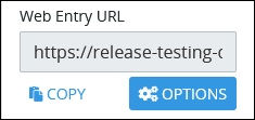
http://pm/webentry/7/node_24, add parameters to the URL that represent the JSON key name and value pairs to add to that Request such ashttp://pm/webentry/7/node_24?data=123&data2=456. Parameters are interpreted as strings.The Web Entry URL displays the URL through which a user can access this task. Click the Copy button to copy the Web Entry URL so that it is available in your clipboard.
Customize the URL
Optionally, customize the Web Entry URL using Request variable values as URL parameters. Reference these Request variable values using single curly brackets surrounding each Request variable name, such as
{variableName}, in the custom URL.Follow these steps to customize the Web Entry URL:
Click the Options button below the Web Entry URL setting. The URL Options screen displays. By default the Standard URL option is enabled, indicating that the automatically generated URL is used for this Web Entry.
Select the Custom URL setting. Settings enable below the Custom URL setting. The Web Entry URL Preview setting displays the currently customized Web Entry URL. If necessary, click the Copy button below the Web Entry URL Preview setting to copy this custom URL.
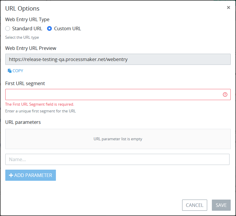
In the First URL segment setting, enter the base segment that displays after your base ProcessMaker Platform instance component of the Web Entry URL. A forward slash (
/) precedes the first URL segment. The first URL segment must be unique to other Web Entry URLs from other Start Event elements in this Process, and may only use alphanumeric characters. This setting is required. In the example below,baseurlis the first URL segment.
Use the URL parameters setting to enter custom parameters in the Web Entry URL based on Request variable name values. In the Name... setting, enter the Request variable name from which to reference its value for the Web Entry URL, and then click the Add Parameter button. That parameter displays within the URL parameters setting with single curly brackets (
{}) surrounding it. In the example below,cityis a Request variable name from which to reference its value for the custom Web Entry URL.
Enter as many parameters as necessary. Use the following icons to remove or sort the order of added URL parameters:
Delete: Click the Delete icon
 to delete the selected parameter from the Web Entry URL.
Sort order: Hold and drag the
 icon to sort the order of parameters in the Web Entry URL. Sort parameters in the URL parameters setting from top to bottom as they are to display left to right in the custom URL.
Click Save to exit the URL Options screen with the saved custom Web Entry URL settings.
The Embed Code setting displays the JavaScript to embed into your Web server's or blog's HTML header. Click the Copy button to copy the Web Entry URL so that it is available in your clipboard.
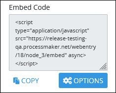
Click the Options button to configure how the chat box displays in the embedded container to which the Web Entry's JavaScript code is applied. When the Options button is clicked, the Embed Options screen displays.
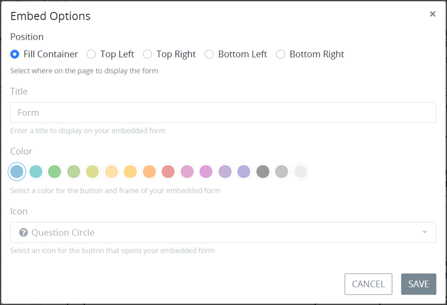
Configure how the chat box displays in the embedded container from the following options:
From the Position setting, select one of the following options:
Fill Container: The chat box displays in the full width of the container.
Top Left: The chat box displays in the top left corner of the container.
Top Right: The chat box displays in the top right corner of the container.
Bottom Left: The chat box displays in the bottom left corner of the container.
Bottom Right: The chat box displays in the bottom right corner of the container.
In the Title setting, enter the title that displays in the chat box.
From the Color setting, select the color that displays for button to show the chat box and for the chat box frame itself.
From the Icon setting, select an icon that displays to show the chat box.
Click Save.
Learn more
