The Photo/Video control enables users to capture photos or videos directly within a screen, enhancing processes with real-time media inputs. This control can be configured for image or video capture, supports overlays for framing guidance, and integrates with ProcessMaker's Intelligent Document Processing (IDP) to send captured media for automated processing.
Capture Flexibility: Capture either photos or videos as part of form submissions.
Customizable Overlays: Add overlays for framing guidance and to standardize media captures.
Automatic Processing: Send captured media directly to ProcessMaker IDP for automated processing, such as OCR or verification.
Cross-Device Compatibility: Optimized for both mobile and desktop, supporting seamless use across devices.
This control is only available for Form-type Screens. See Screen Types.
Watch the following product tour to learn how to use a Photo/Video control.
Add the Control to a Screen
Permissions
Your user account or group membership must have the following permissions to design a Screen unless your user account has the Make this user a Super Admin setting selected:
Screens: Edit Screens
Screens: View Screens
See the Screens permissions or ask your Administrator for assistance.
Follow these steps to add this control to the Screen:
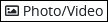
From the Controls Menu on the left, expand the Input Fields category, and then locate the Photo/Video icon
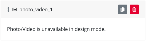
Drag and drop the control onto the Screen Builder canvas. Note that the media capture functionality won’t appear in design mode. Preview the screen to see it in action.
Configure the Photo/Video control. See Settings.
Validate that the control is configured correctly. See Validate Your Screen.
Click the Preview button to test the control.
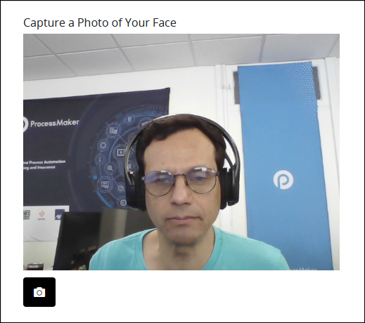
Click the camera icon
 to capture the photo/video.
Click the upload icon
 icon to upload the captured image.
Settings
The Image control has the following configurable settings in the Properties Panel:
Variable Panel Settings
Expand the Variable panel from the Properties Panel on the right to configure the following properties:
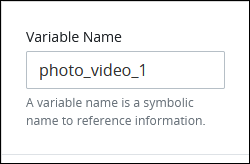
Variable Name
Edit the default Variable Name setting for this control if necessary. The Variable Name is used to reference this control during a case. Ensure that the Variable Name is unique in this Screen and contains at least one letter. This is a required setting.
Use the Variable Name setting value in the following ways:
Reference this control by its Variable Name setting's value. The Data Preview panel in Preview mode represents the state of the Photo/Video control using its Variable Name value in the Request's JSON data model.
Reference this control's value in a different control. To do so, use mustache syntax and reference this control's Variable Name value in the target control. Example:
{{ photo_video_1 }}.Reference this value in Visibility Rule setting expressions.
See best practices when editing a Request variable name.
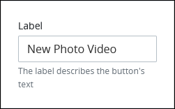
Label
Edit the default label that displays for this control if necessary. New Photo Video is the default value.
Configuration Panel Settings
Expand the Configuration panel from the Properties Panel on the right to configure the following properties:
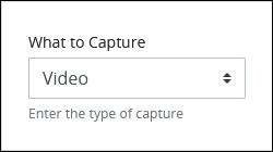
Select the type of media this control can capture:
Photo: Select the Photo option to capture a still image. Use this option to record a photograph of the face or a national ID card. This is the default option.
Video: Select the Video option to capture a video.
If your device has more than one camera available, such as a front and rear camera, optionally switch between them in Preview mode and during use.
Enable the Send to IDP toggle key to send the captured photo or video to a pre-configured ProcessMaker IDP folder. Follow these steps to upload the photo/video to IDP:
Enable the Send to IDP toggle key. The Document Type setting displays.
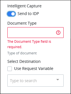
In the Document Type setting, enter the document type or a variable (without mustache syntax) that contains the document type. This setting does not refer to a file type, such as
PDForDOCX. Instead, this setting refers to theDOCUMENT_TYPEdomain in ProcessMaker IDP that has been previously trained to process documents in a dossier. Note that this setting requires theDocument_TypeDomain's Name setting value, not its Pretty Name setting value.Where do I find
DOCUMENT_TYPEin ProcessMaker IDP?Determine Which Document Type to Use
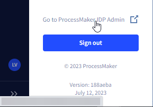
Log on to ProcessMaker IDP. If you need assistance logging on, contact your ProcessMaker IDP Administrator for assistance.
Click the initials of your user account in the lower-left in ProcessMaker IDP, and then select the Go to ProcessMaker IDP Admin option.
Click the Domains option from the left navigation pane.
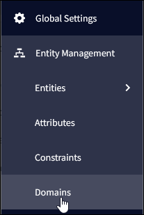
The Domains page displays.
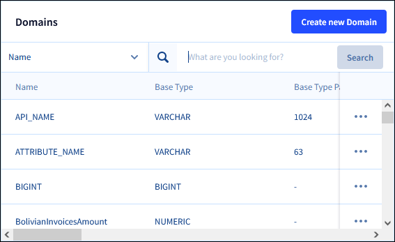
Locate the
Document_Typedomain, click its options menu, and then select the Edit option.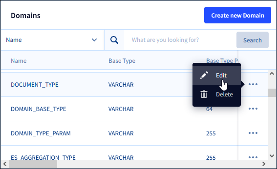
The Edit Domain page displays for the
Document_TypeDomain.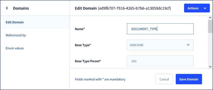
Click the Enum values option from the left-side pane. The Enum values for Domain page displays the enumeration values for the
Document_TypeDomain.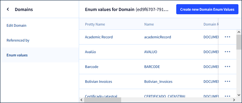
Browse the list of values for the
Document_TypeDomain, and then locate theDocument_TypeDomain value that this IDP connector uses to process documents.Click the options menu for your document type, and then select the Edit option.
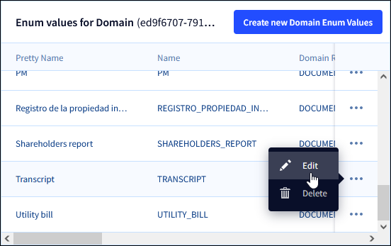
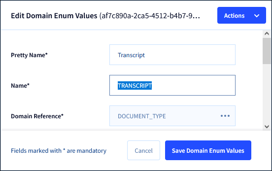
Make note of the Name value for your document type. Use this value for the IDP connector's Document Type setting. An example is highlight below. Do not use the Pretty Name setting value for your document type.
From the Select Destination setting, do one of the following:
Select the Use Request Variable option, and enter a variable name (without mustache syntax) that contains the name of the destination folder in IDP where the file should be uploaded. If the folder does not exist, a new folder is automatically created.
Ensure that the Use Request Variable setting is not selected, then choose a destination folder from the drop-down list. These folders already exist in ProcessMaker IDP and are configured in the destination folder settings for IDP.
Note:
If the Send to IDP toggle key is enabled but at least one ProcessMaker IDP folder is not already configured, then the following message displays when the Screen opens:
401 Unauthorized: Unable to access the IDP folders. The folders may not be configured for your environment or may not exist. Please contact your administrator.
Ensure to configure a ProcessMaker IDP folder prior to deploying this Screen to production.
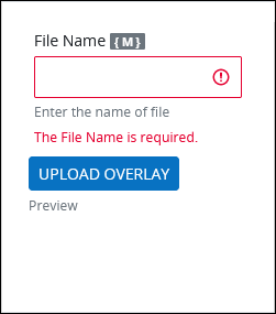
After a file is uploaded via the Photo/Video control, it is stored in the File Manager. If the Send to IDP option is selected, it is also uploaded to ProcessMaker IDP. Use the File Name setting to specify the name that will be used when saving the uploaded photo or video. Enter static text or use mustache syntax to set the file name using a variable. This is a required setting.
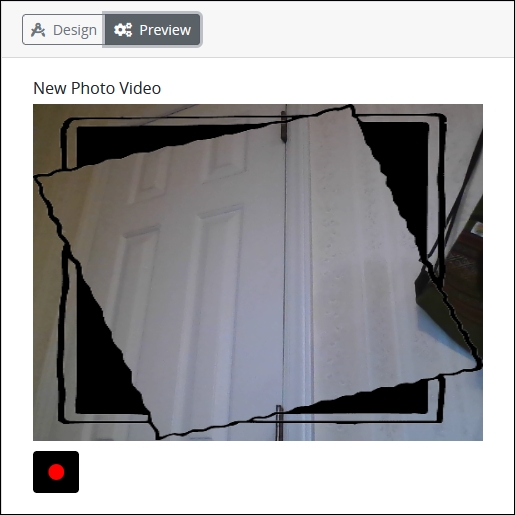
Optionally, click the Upload Overlay button to upload a custom overlay that displays over the real-time capture area prior to recording the photo or video. The following file types are supported:
GIF
JPG
PNG
WebP
When an overlay is uploaded, a preview displays below the Upload Overlay button.
Below is an example in Preview mode.
Design Panel Settings
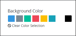
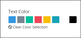
Expand the Design panel from the Properties Panel on the right to configure the following properties:
Advanced Panel Settings
Expand the Advanced panel from the Properties Panel on the right to configure the following properties:
Enter the value to represent this control in custom CSS syntax when in Custom CSS mode. As a best practice, use the same CSS Selector Name value on different controls of the same type to apply the same custom CSS style to all those controls.
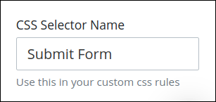
Then, use this name in the Custom CSS feature to apply CSS styling to this control as follows:
[selector='Submit Form'] {
    color: blueviolet;
}
See the following best practices regarding custom CSS in Screens:
Specify an expression that indicates the condition(s) under which this control displays. See Expression Syntax Components. If this setting does not have an expression, then this control displays by default.
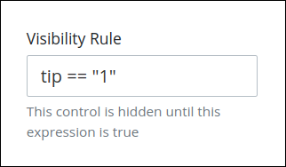
For example, this control displays if the variable value tip is 1. For a detailed example of the Visibility Rule setting, see Show or Hide Controls Based on Button Selection.
Note the following regarding how to use visibility rules:
To make this control hidden until another control contains a value, enter the Variable Name setting value of that control to this control's Visibility Rule setting.
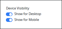
Select on which device types this control displays:
Desktop: The control displays only on desktop devices. Enable the Show for Desktop toggle key.
Mobile: The control displays only on mobile devices. Enable the Show for Mobile toggle key.
Both: The control displays on both desktop and mobile devices. Both toggle keys are enabled by default.