The Image control has the following functionality:
The Image control displays a specified image that is GIF, JPG, or PNG file types.
The image control may reference another control's Variable Name setting to display its value, such as to display the signature saved in a Signature control. The Signature control saves the signature as a PNG image.
This control is only available for the following Screen types:
Display type
Form type
See Screen Types.
Watch the following product tour to learn how to use a Image control.
Add the Control to a Screen
Permissions
Your user account or group membership must have the following permissions to design a Screen unless your user account has the Make this user a Super Admin setting selected:
Screens: Edit Screens
Screens: View Screens
See the Screens permissions or ask your Administrator for assistance.
Follow these steps to add this control to the Screen:
Create a new Form-type or Display-type Screen or edit an existing one.
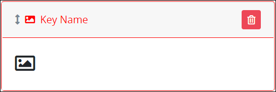
From the Controls Menu on the left, expand the Content Fields category and then locate the Image icon
 .
.Drag and drop the control to the Screen Builder canvas. Existing controls in the Screen will adjust positioning based on where you drag the control.
Configure the Image control. See Settings.
Validate that the control is configured correctly. See Validate Your Screen.
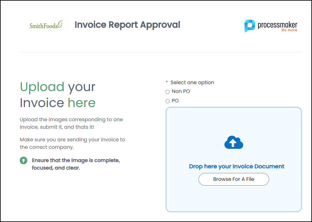
Below is an Image control used in the top bar and configured in three columns.
Settings
The Image control has the following configurable settings in the Properties Panel:
Configuration Panel Settings
Expand the Configuration panel from the Properties Panel on the right to configure the following properties:
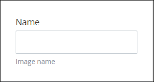
Name
Enter the alphanumeric name that identifies the image in this Screen.
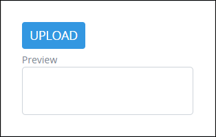
Upload
Click the Upload button to browse for the GIF, JPG, or PNG file type image to upload to the Image control.
Preview
Preview the uploaded image.
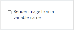
Render Image from a Variable Name
Select the Render image from a variable name setting to render as an image the content of another control by referencing that control's Variable Name setting value. For example, render an image of a signature from the Signature control.
Do not use this setting to display a file referenced from a File Upload control.
After selecting the Render image from a variable name setting, the Variable Name setting displays.
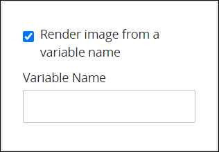
In the Variable Name setting, enter the Request variable name setting value of the content to display as an image in the Image control. This Request variable must contain the content of the image. For example, to display a digital signature entered into a Signature control with a Variable Name setting of SignDocument, enter SignDocument. If the Signature control has been signed, that digital signature displays in the Image control when it displays.
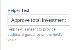
Helper Text
Enter text that provides additional guidance on this control's use. This setting has no default value.
Design Panel Settings
Expand the Design panel from the Properties Panel on the right to configure the following properties:
Height
Enter the height of the uploaded image in pixels. If the Width setting has no value, the Image control adjusts the uploaded image to the Height setting value.

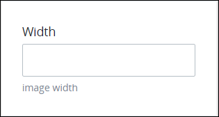
Width
Enter the width of the uploaded image in pixels. If the Height setting has no value, the Image control adjusts the uploaded image to the Width setting value.
Advanced Panel Settings
Expand the Advanced panel from the Properties Panel on the right to configure the following properties:
Visibility Rule
Specify an expression that indicates the condition(s) under which this control displays. See Expression Syntax Components. If this setting does not have an expression, then this control displays by default.
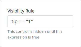
For example, this control displays if the variable value tip is 1. For a detailed example of the Visibility Rule setting, see Show or Hide Controls Based on Button Selection.
Note the following regarding how to use visibility rules:
To make this control hidden until another control contains a value, enter the Variable Name setting value of that control to this control's Visibility Rule setting.
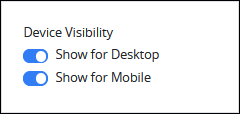
Device Visibility
Select on which device types this control displays:
Desktop: The control displays only on desktop devices. Enable the Show for Desktop toggle key.
Mobile: The control displays only on mobile devices. Enable the Show for Mobile toggle key.
Both: The control displays on both desktop and mobile devices. Both toggle keys are enabled by default.
CSS Selector Name
Enter the value to represent this control in custom CSS syntax when in Custom CSS mode. As a best practice, use the same CSS Selector Name value on different controls of the same type to apply the same custom CSS style to all those controls.
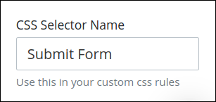
Then, use this name in the Custom CSS feature to apply CSS styling to this control as follows:
[selector='Submit Form'] {
    color: blueviolet;
}
See the following best practices regarding custom CSS in Screens: