Use the Nested Screen control to nest a separate Screen into that control. In doing so, the separate Screen embeds into the Nested Screen control. The Nested Screen control is a placeholder for the embedded Screen such that the Request participant experiences the nested Screen as designed. When the Task loads the Screen using a Nested Screen control, the Nested Screen loads the latest version of the referenced Screen.
The Screen containing the Nested Screen control is the parent Screen. The Screen that is nested is the child Screen.
During an in-progress Requests, both Request and Magic Variable data pass to a child Screen when it displays within the parent Screen. Furthermore, information that is entered into a child Screen displays in Request summaries that use the parent Screen.
A nested Screen has the following attributes that vary from how it may have been designed:
CSS takes precedent: Any CSS designed in Custom CSS mode in the parent Screen takes precedent over any CSS designed in the child (nested) Screens. The Request participant experiences one design experience without a variety of design styles.
Submit Button control in nested Screens is hidden: During in-progress Requests, the Submit Button control is hidden in child Screens so that the Request participant uses the parent Screen's Submit Button control to submit the Task.
Two Screens cannot reference each other indefinitely: A child Screen that has already displayed within a parent Screen cannot display again in the same Request. This prevents an infinite loop whereby two Screens using Nested Screen controls reference each other indefinitely.
Only Display- and Form-type Screens may be selected for nesting into a Nested Screen control.
Screen designers can easily build a Screen by placing modular components into one Screen. For example, in a Screen designed for a purchase request, use Nested Screen controls as placeholders for the following components that are designed in separate Screens. Each of these Screens are nested into its own Nested Screen control.
Nested Screen control for Screen 1: Personal information
Nested Screen control for Screen 2: Payment information
Nested Screen control for Screen 3: Billing information
Nested Screen control for Screen 4: Shipping information
This control is only available for Form-type Screens. See Screen Types.
Watch the following product tour to learn how to use a Nested Screen control.
Add the Control to a Screen
Permissions
Your user account or group membership must have the following permissions to design a Screen unless your user account has the Make this user a Super Admin setting selected:
Screens: Edit Screens
Screens: View Screens
See the Screens permissions or ask your Administrator for assistance.
Follow these steps to add this control to the Screen:
From the Controls Menu on the left, expand the Content Fields category, and then locate the Nested Screen icon
 .
.Drag and drop the control to the Screen Builder canvas. Existing controls in the Screen will adjust positioning based on where you drag the control.

Configure the Nested Screen control. See Settings.
Validate that the control is configured correctly. See Validate Your Screen.
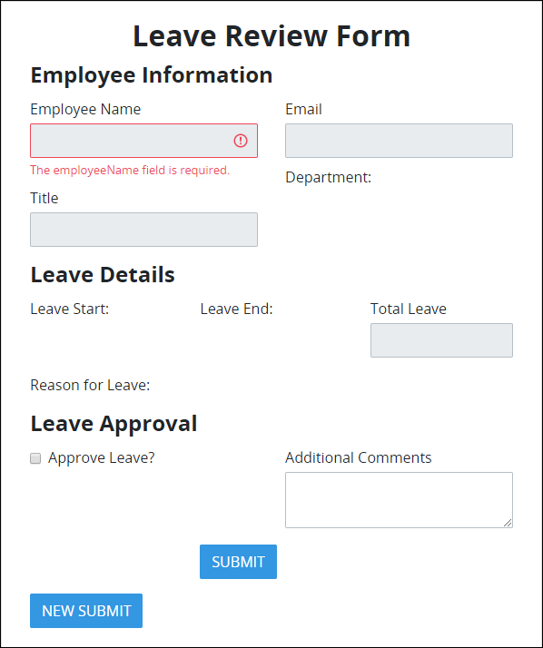
Below is a Nested Screen in the Leave Approval section.
Settings
The Nested Screen control has the following configurable settings in the Properties Panel:
Variable Panel Settings
Expand the Variable panel from the Properties Panel on the right to configure the following properties:
Screen
Select which Screen to nest into this control. The nested Screen becomes the child Screen to the parent Screen that uses the Nested Screen control. Any Screen type may be selected for nesting into a Nested Screen control. However, only Form- and Display-type Screens preview in either Design or Preview modes.
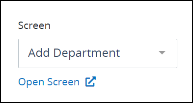
After selecting a screen, you can open it to edit in the Screen Builder in another window.
Advanced Panel Settings
Expand the Advanced panel from the Properties Panel on the right to configure the following properties:
Visibility Rule
Specify an expression that indicates the condition(s) under which this control displays. See Expression Syntax Components. If this setting does not have an expression, then this control displays by default.
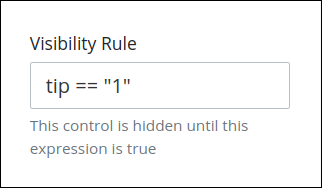
For example, this control displays if the variable value tip is 1. For a detailed example of the Visibility Rule setting, see Show or Hide Controls Based on Button Selection.
Note the following regarding how to use visibility rules:
To make this control hidden until another control contains a value, enter the Variable Name setting value of that control to this control's Visibility Rule setting.
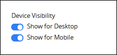
Device Visibility
Select on which device types this control displays:
Desktop: The control displays only on desktop devices. Enable the Show for Desktop toggle key.
Mobile: The control displays only on mobile devices. Enable the Show for Mobile toggle key.
Both: The control displays on both desktop and mobile devices. Both toggle keys are enabled by default.
CSS Selector Name
Enter the value to represent this control in custom CSS syntax when in Custom CSS mode. As a best practice, use the same CSS Selector Name value on different controls of the same type to apply the same custom CSS style to all those controls.
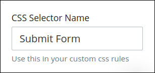
Then, use this name in the Custom CSS feature to apply CSS styling to this control as follows:
[selector='Submit Form'] {
    color: blueviolet;
}
See the following best practices regarding custom CSS in Screens: