The Page Navigation control adds a button from which the Request participant can go to another page in a multi-page Screen. See a design example.
This control is only available for Form-type Screens. See Screen Types.
Watch the following product tour to learn how to use a Page Navigation control.
For a documented example of using this control, see Page Navigation Control to Design a Multi-Page Screen.
Add the Control to a Screen
Permissions
Your user account or group membership must have the following permissions to design a Screen unless your user account has the Make this user a Super Admin setting selected:
Screens: Edit Screens
Screens: View Screens
See the Screens permissions or ask your Administrator for assistance.
Follow these steps to add this control to the Screen:
From the Controls Menu on the left, expand the Navigation category, and then locate the Page Navigation icon
 .
.Drag and drop the control to the Screen Builder canvas. Existing controls in the Screen will adjust positioning based on where you drag the control.
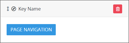
Configure the Page Navigation control. See Settings.
Validate that the control is configured correctly. See Validate Your Screen.
Below is a Page Navigation control using the "Secondary" Variant option.
For a documented example of using this control, see Page Navigation Control to Design a Multi-Page Screen.
Settings
The Page Navigation control has the following configurable settings in the Properties Panel:
Variable Panel Settings
Expand the Variable panel from the Properties Panel on the right to configure the following properties:
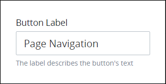
Button Label
Enter the text label that displays for this control. Page Navigation is the default value.
Configuration Panel Settings
Expand the Configuration panel from the Properties Panel on the right to configure the following properties:
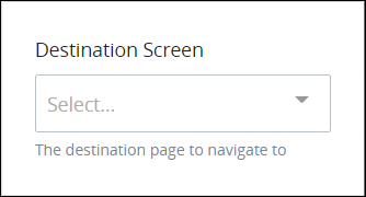
Destination Screen
Select the destination page to which to navigate in a multi-page Screen. Current pages in the multi-page Screen display. If the Screen contains only one page, the Destination Screen setting displays No Data Available when selected.
Design Panel Settings
Expand the Design panel from the Properties Panel on the right to configure the following properties:
Button Variant Style
Select the style for the Page Navigation control. The style changes the control's appearance but otherwise has no functional difference. Select from the following options:
Primary: Blue-colored background with white-colored Button Label text. This is the default option.
Secondary: Gray-colored background with white-colored Button Label text.
Success: Green-colored background with white-colored Button Label text.
Danger: Red-colored background with white-colored Button Label text.
Warning: Yellow-colored background with black-colored Button Label text.
Info: Teal-colored background with white-colored Button Label text.
Light: White-colored background with black-colored Button Label text.
Dark: Black-colored background with white-colored Button Label text.
Link: White-colored background with blue-colored Button Label text.

Advanced Panel Settings
Expand the Advanced panel from the Properties Panel on the right to configure the following properties:
Visibility Rule
Specify an expression that indicates the condition(s) under which this control displays. See Expression Syntax Components. If this setting does not have an expression, then this control displays by default.
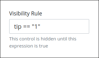
For example, this control displays if the variable value tip is 1. For a detailed example of the Visibility Rule setting, see Show or Hide Controls Based on Button Selection.
Note the following regarding how to use visibility rules:
To make this control hidden until another control contains a value, enter the Variable Name setting value of that control to this control's Visibility Rule setting.
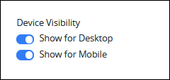
Device Visibility
Select on which device types this control displays:
Desktop: The control displays only on desktop devices. Enable the Show for Desktop toggle key.
Mobile: The control displays only on mobile devices. Enable the Show for Mobile toggle key.
Both: The control displays on both desktop and mobile devices. Both toggle keys are enabled by default.
CSS Selector Name
Enter the value to represent this control in custom CSS syntax when in Custom CSS mode. As a best practice, use the same CSS Selector Name value on different controls of the same type to apply the same custom CSS style to all those controls.
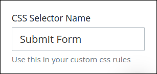
Then, use this name in the Custom CSS feature to apply CSS styling to this control as follows:
[selector='Submit Form'] {
    color: blueviolet;
}
See the following best practices regarding custom CSS in Screens:
Accessibility Panel Settings
The Accessibility panel centralizes settings that enhance screen-reader compatibility and overall usability. ARIA Label setting persists through import, copy/paste, versioning, and upgrades, supporting a more inclusive and standards-aligned Screen Builder experience.
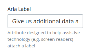
Aria Label
Enter the string that provides a text alternative to this control for the following purposes:
Assistive technology, such as screen readers, read the Aria Label setting value.
This control has a visual indication of its purpose, such as a control that uses a graphic instead of text, but still needs to clarify that purpose for anyone who cannot access the visual indication.
The Aria Label setting value replaces the Label setting value. For example, if a control has both a Label setting value and an Aria Label setting value, assistive technology only uses the Aria Label setting value.
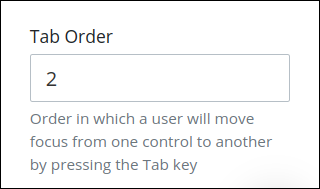
Tab Order
Tab order determines the sequential navigation order to navigate a Screen's controls using a keyboard interface. Assistive technology users often use a keyboard for navigation.
See best practices for setting the tab order for a Screen's controls.
Enter the number for the sequential keyboard navigation order that this control takes focus amongst other controls in this Screen.