Add a control from which the Request participant can select or deselect an option.
Control Description
The Checkbox control adds a checkbox from which the Request participant can select or deselect an option. Multiple Checkbox controls can be grouped together to function as one set of options whereby separate Checkbox controls with the same name maintain the same selected or deselected state.
This control is only available for Form-type Screens. See Screen Types.
Watch the following product tour to learn how to use a Checkbox control.
See an example of using a check box control in a screen.
Add the Control to a Screen
Permissions
Your user account or group membership must have the following permissions to design a Screen unless your user account has the Make this user a Super Admin setting selected:
Screens: Edit Screens
Screens: View Screens
See the Screens permissions or ask your Administrator for assistance.
Follow these steps to add this control to a Screen:
From the Controls Menu on the left, expand the Fields category, and then locate the Checkbox control
 .
.Drag and drop the control to the Screen Builder canvas. Existing controls in the Screen will adjust positioning based on where you drag the control.
Configure the Checkbox control. See Settings.
Validate that the control is configured correctly. See Validate Your Screen.
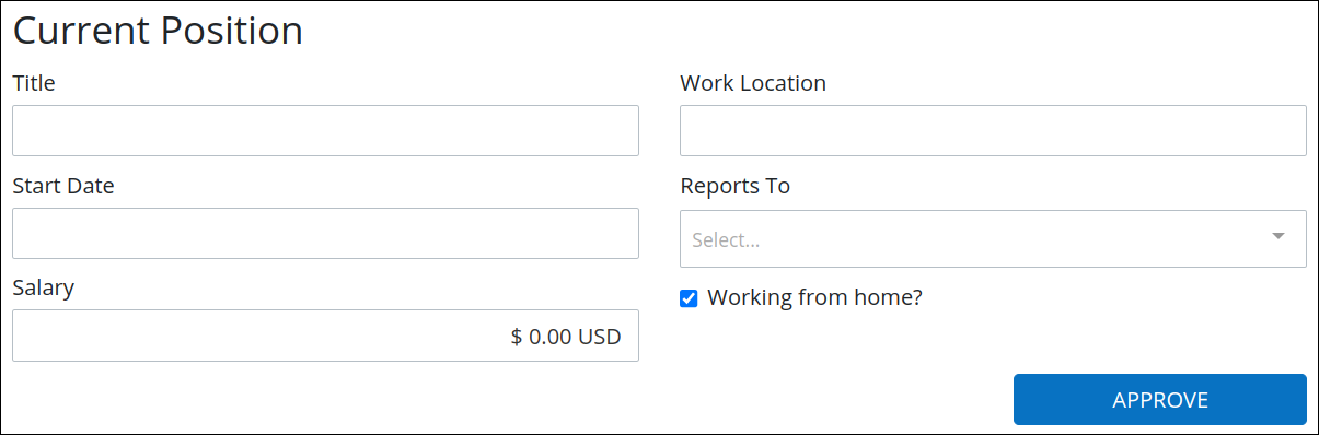
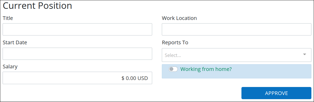
The following screen includes a Checkbox control, allowing users to select the option to work from home.
Settings
The Checkbox control has the following configurable settings in the Properties Panel:
Variable Panel Settings
Expand the Variable panel from the Properties Panel on the right to configure the following properties:
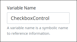
Variable Name
The Variable Name setting is used to reference control data during Requests. Ensure that the Variable Name setting value is a unique name in this Screen and contains at least one letter. This is a required setting.
Use the Variable Name setting value in the following ways:
Reference this control by its Variable Name setting's value. The Data Preview panel in Preview mode represents the state of the Checkbox control using its Variable Name value in the Request's JSON data model in the following ways:
The Checkbox control is selected: The key's value is
true.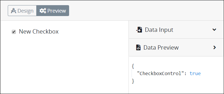
The Checkbox control is not selected: The key's value is
false.
Reference this control's value in a different Screen Builder control. To do so, use mustache syntax and reference this control's Variable Name value in the target control. Example:
{{ CheckboxControl }}.Reference this value in Visibility Rule setting expressions.
See best practices when editing a Request variable name.
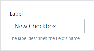
Label
The Label property displays on the top of the control in the screen. Use it to explain the purpose of the control.
Validation Rules
Enter the validation rule(s) the Request participant must comply with to properly enter a valid value into this control. This setting has no default value. If there are no configured validation rules the following message displays: No validation rule(s).
See Validation Rules for "Validation" Control Settings for details on how to use validation rules.
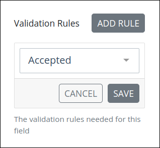
Click the Add Rule button.
Select the rule that this control validates against.
Click Save. Parameters for the selected rule display. Parameter settings display which ones are required to properly configure the rule.
Enter the parameter settings that this control uses to validate against. See Validation Rule Settings, and then locate the validation rule for its parameters.
Follow these steps to edit a validation rule for this control:
Access the Variable panel for this control while in Design mode, and then locate the Validation Rules setting.
Click the Edit icon
 for the validation rule to edit if that rule can be edited. Validation rules that do not have parameters cannot be edited. The parameter settings for that validation rule displays.
Edit the parameter settings that this control uses to validate against. See Validation Rule Settings, and then locate the validation rule for its parameters.
Follow these steps to delete a validation rule for this control:
Access the Variable panel for this control while in Design mode, and then locate the Validation Rules setting.
Click the Delete icon
 for the validation rule to delete. A message displays to confirm deletion of the validation rule.
Click Delete.
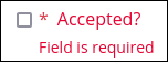
Make Required
Select to indicate that this control is required. This option is not selected by default. This is a quick way to add the Required validation rule. 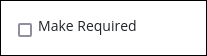
If you submit the Screen without selecting this required Checkbox, this control displays Field is required in red-colored text.
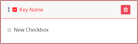
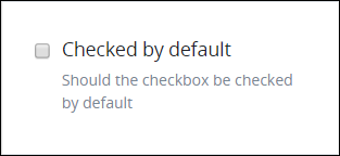
Checked by Default
Select to indicate that this control is selected by default such that its value is true. This option is not selected by default.
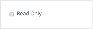
Read Only
Select to indicate that this control cannot be edited. This option is not selected by default.
Configuration Panel Settings
Expand the Configuration panel from the Properties Panel on the right to configure the following properties:
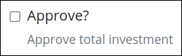
Helper Text
Enter text that provides additional guidance on this control's use. This setting has no default value.
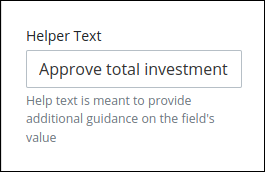
For example, if you enter Approve total investment, the checkbox displays as follows:
Design Panel Settings
Expand the Design panel from the Properties Panel on the right to configure the following properties:
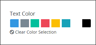
Text Color
Select the text color that displays for this control. Click the Clear Color Selection option to remove the selected color.
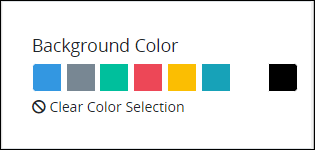
Background Color
Select the background color that displays for this control. Click the Clear Color Selection option to remove the selected color.
Toggle Style
Select to display a toggle key control instead of a checkbox control for each checkbox option. See a design example.
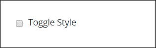
For instance, the checkbox field Working from home? has a success text color, a primary background hue, and a toggle design.
Advanced Panel Settings
Expand the Advanced panel from the Properties Panel on the right to configure the following properties:
Visibility Rule
Specify an expression that indicates the condition(s) under which this control displays. See Expression Syntax Components. If this setting does not have an expression, then this control displays by default.
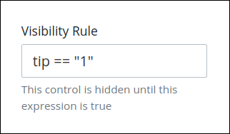
For example, this control displays if the variable value tip is 1. For a detailed example of the Visibility Rule setting, see Show or Hide Controls Based on Button Selection.
Note the following regarding how to use visibility rules:
To make this control hidden until another control contains a value, enter the Variable Name setting value of that control to this control's Visibility Rule setting.
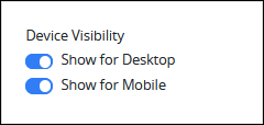
Device Visibility
Select on which device types this control displays:
Desktop: The control displays only on desktop devices. Enable the Show for Desktop toggle key.
Mobile: The control displays only on mobile devices. Enable the Show for Mobile toggle key.
Both: The control displays on both desktop and mobile devices. Both toggle keys are enabled by default.
CSS Selector Name
Enter the value to represent this control in custom CSS syntax when in Custom CSS mode. As a best practice, use the same CSS Selector Name value on different controls of the same type to apply the same custom CSS style to all those controls.
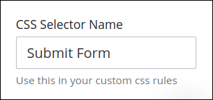
Then, use this name in the Custom CSS feature to apply CSS styling to this control as follows:
[selector='Submit Form'] {
    color: blueviolet;
}
See the following best practices regarding custom CSS in Screens:
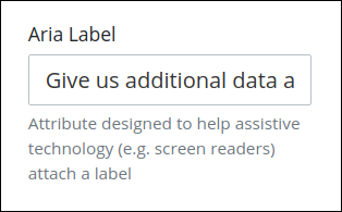
Aria Label
Enter the string that provides a text alternative to this control for the following purposes:
Assistive technology, such as screen readers, read the Aria Label setting value.
This control has a visual indication of its purpose, such as a control that uses a graphic instead of text, but still needs to clarify that purpose for anyone who cannot access the visual indication.
The Aria Label setting value replaces the Label setting value. For example, if a control has both a Label setting value and an Aria Label setting value, assistive technology only uses the Aria Label setting value.
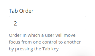
Tab Order
Tab order determines the sequential navigation order to navigate a Screen's controls using a keyboard interface. Assistive technology users often use a keyboard for navigation.
See best practices for setting the tab order for a Screen's controls.
Enter the number for the sequential keyboard navigation order that this control takes focus amongst other controls on this Screen.