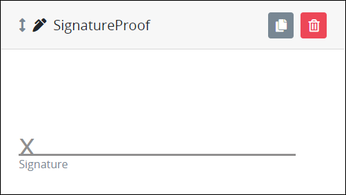
The Signature control allows the Request participant to sign and her or his signature in a Screen. The entered signature automatically saves, but is not committed until the signer submits the Screen. The signer may undo the entered signature prior to submitting the Screen. The submitted signature is recorded as a PNG image that may be referenced from an Image control by referencing the Signature control's Variable Name setting value.
This control is only available for Form-type Screens. See Screen Types.
Watch the following product tour to learn how to use a Signature control.
Add the Control to a Screen
Permissions
Your user account or group membership must have the following permissions to design a Screen unless your user account has the Make this user a Super Admin setting selected:
Screens: Edit Screens
Screens: View Screens
See the Screens permissions or ask your Administrator for assistance.
Follow these steps to add this control to the Screen:
From the Controls Menu on the left, expand the Input Fields category, and then locate the Signature icon
 .
.Drag and drop the control to the Screen Builder canvas. Existing controls in the Screen will adjust positioning based on where you drag the control.
Configure the Image control. See Settings.
Validate that the control is configured correctly. See Validate Your Screen.
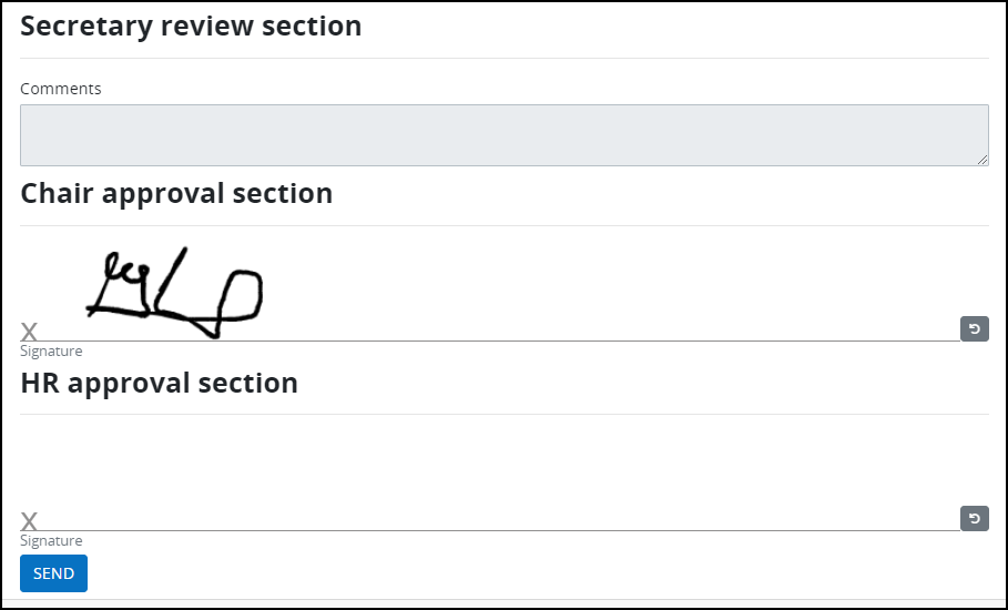
Below are digital Signatures to approve a request.
Settings
The Signature control has the following configurable settings in the Properties Panel:
Variable Panel Settings
Expand the Variable panel from the Properties Panel on the right to configure the following properties:
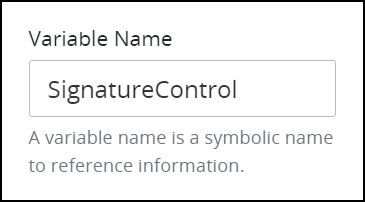
Variable Name
Enter the alphanumeric name that identifies this Screen. This field is required.
Use the Variable Name setting value in the following ways:
Reference this control by its Variable Name setting's value. The Data Preview panel in Preview mode corresponds the Signature control's textual content with that Textarea control's Variable Name value. In the example below,
SignatureControlis the Variable Name setting's value.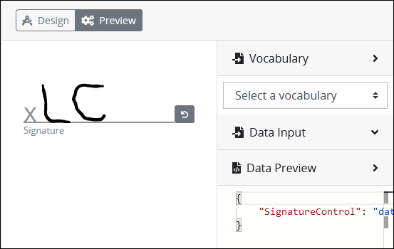
Reference this control's value in a different Screen Builder control. To do so, use mustache syntax and reference this control's Variable Name value in the target control. Example:
{{ SignatureControl }}.Reference this value in Visibility Rule setting expressions.
See best practices when editing a Request variable name.
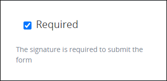
Required
Select the Required setting to clarify that the signature is required to submit the form.
Configuration Panel Settings
Expand the Configuration panel from the Properties Panel on the right to configure the following properties:
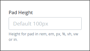
Pad Height
Set the vertical spacing of the Signature control's pad: the space into which the signature is entered.
The height may be set in any of the following units:
em unit, based upon the relative font-size of the parent font size (em)
inches (in)
percentage (%)
pixels (px)
relative to the viewpoint's height (vh)
relative to the viewpoint's width (vw)
rem unit, based upon the font-size value of the root element (rem)
100px is the default height setting.
If the entered value is not in the correct format, the following validation error displays: The Pad Height format is invalid.
Advanced Panel Settings
Expand the Advanced panel from the Properties Panel on the right to configure the following properties:
Visibility Rule
Specify an expression that indicates the condition(s) under which this control displays. See Expression Syntax Components. If this setting does not have an expression, then this control displays by default.
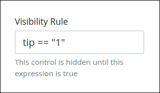
For example, this control displays if the variable value tip is 1. For a detailed example of the Visibility Rule setting, see Show or Hide Controls Based on Button Selection.
Note the following regarding how to use visibility rules:
To make this control hidden until another control contains a value, enter the Variable Name setting value of that control to this control's Visibility Rule setting.
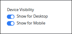
Device Visibility
Select on which device types this control displays:
Desktop: The control displays only on desktop devices. Enable the Show for Desktop toggle key.
Mobile: The control displays only on mobile devices. Enable the Show for Mobile toggle key.
Both: The control displays on both desktop and mobile devices. Both toggle keys are enabled by default.
CSS Selector Name
Enter the value to represent this control in custom CSS syntax when in Custom CSS mode. As a best practice, use the same CSS Selector Name value on different controls of the same type to apply the same custom CSS style to all those controls.
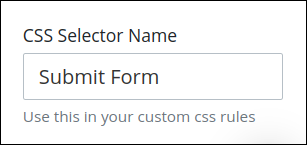
Then, use this name in the Custom CSS feature to apply CSS styling to this control as follows:
[selector='Submit Form'] {
    color: blueviolet;
}
See the following best practices regarding custom CSS in Screens: