The Submit Button control adds a button to the Screen. The Submit Button control has two functions:
Submit: Submits the Screen whilst setting this control's value as specified from the Value setting. This is the default setting.
Do Not Submit, Set Value: Sets this control's value as specified from the Value setting, but does not submit the Screen.
This control is only available for Form-type Screens. See Screen Types.
Examples
See how to configure a Submit Button control that prevents the Request participant from clicking on that control multiple times so the Screen cannot be submitted after the first click.
For a documented example of using this control, see Show or Hide Controls Based on Button Selection.
Add the Control to a Screen
Permissions
Your user account or group membership must have the following permissions to design a Screen unless your user account has the Make this user a Super Admin setting selected:
Screens: Edit Screens
Screens: View Screens
See the Screens permissions or ask your Administrator for assistance.
Follow these steps to add this control to the Screen:
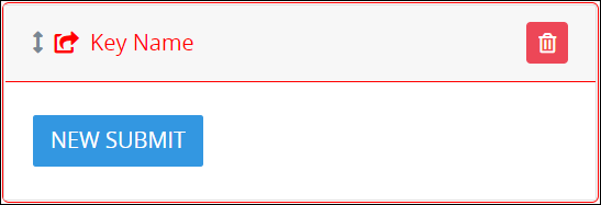
From the Controls Menu on the left, expand the Input Fields category, and then locate the Submit Button icon.
Drag and drop the control to the Screen Builder canvas. Existing controls in the Screen will adjust positioning based on where you drag the control.
Configure the Submit Button control. See Settings.
Validate that the control is configured correctly. See Validate Your Screen.
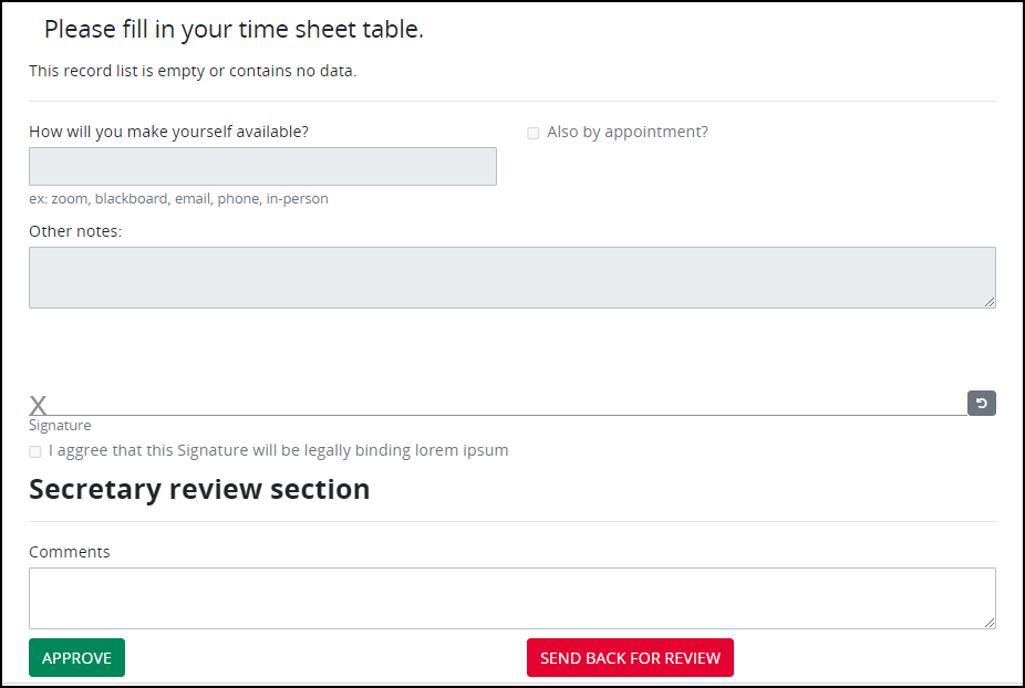
Below is a form with two Submit Button controls.
Settings
The Submit Button control has the following configurable settings in the Properties Panel:
Variable Panel Settings
Expand the Variable panel from the Properties Panel on the right to configure the following properties:
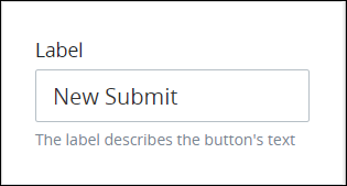
Label
Edit the default label that displays for this control if necessary. New Submit is the default value.
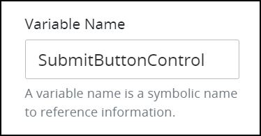
Variable Name
Edit the default Variable Name setting value for this control if necessary. The Variable Name setting value represents data in this control during Requests. Ensure that the Variable Name setting value is a unique name from other controls in this Screen and contains at least one letter. This is a required setting.
Use the Variable Name setting value in the following ways:
Reference this control by its Variable Name setting's value. The Data Preview panel in Preview mode corresponds the Submit Button control's Variable Name value. In the example below,
SubmitButtonControlis the Variable Name setting's value when the button is clicked.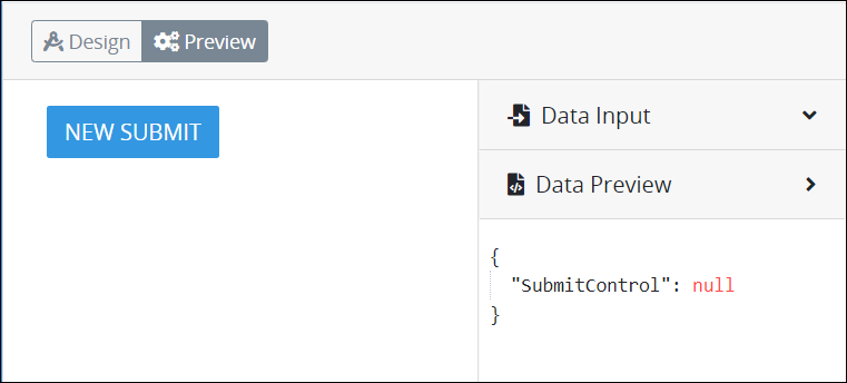
Reference this control's value in a different Screen Builder control. To do so, use mustache syntax and reference this control's Variable Name value in the target control. Example:
{{ SubmitButtonControl }}.Reference this value in Visibility Rule setting expressions.
See best practices when editing a Request variable name.
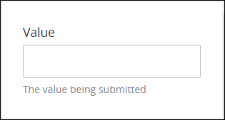
Value
Enter any alphanumeric value that represents data when the Request participant selects the Submit Button control. This value can be evaluated in a Visibility Rule setting expression or in a Sequence Flow element's condition(s) to trigger.
See how to configure a Submit Button control that prevents the Request participant from clicking on that control multiple times so the Screen cannot be submitted after the first click.
Configuration Panel Settings
Expand the Configuration panel from the Properties Panel on the right to configure the following properties:
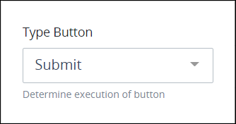
Type Button
Select from the following options how the Submit Button control functions when the control is clicked:
Submit: Submits the Screen whilst setting this control's value as specified from the Value setting. This is the default setting.
Do Not Submit, Set Value: Sets this control's value as specified from the Value setting, but does not submit the Screen.
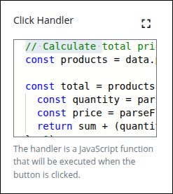
Click Handler
Use the Click Handler field to define a JavaScript function that runs when the associated button is clicked. This allows you to add interactive behaviors to your screen—such as updating data, switching panels, performing calculations, or setting values within the screen’s data model.
Supports only JavaScript alerts, and console.log commands.
Click the Expand icon  to open a larger editor, making it easier to write and organize your code.
The Secure Handler Execution toggle allows developers to control how button Click Handlers are executed—either in a secure (sandboxed) or non-secure (legacy-compatible) manner. This setting enhances flexibility when executing custom JavaScript in button controls, while maintaining security boundaries based on the environment configuration.
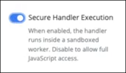
This toggle is not visible by default. To enable it, an administrator must configure the following environment variable:
SCREEN_SECURE_HANDLER_TOGGLE_VISIBLE=trueWhen set to true, the Secure Handler Execution toggle appears in the configuration panel of any Submit Button control.
Example: Triggering a Total Price Calculation
Let’s say you have a screen with a list of products, each with a quantity and unit price. You want to calculate the total price when a button is clicked and store it in the total variable.
// Calculate total price from all products
const products = data.products || [];
const total = products.reduce((sum, product) => {
  const quantity = parseFloat(product.quantity || 0);
  const price = parseFloat(product.unitPrice || 0);
  return sum + (quantity * price);
}, 0);
// Return updated value to the screen
return {
  _root: {
    total
  }
};
✅ Use Case
Inventory or Sales Form where a user selects quantities and prices, and needs to calculate totals on demand without waiting for server-side logic.
🧠 Key Concepts
data.products: Accesses the array of product records.reduce(): Loops through the array and calculates the total._root.total: Updates thetotalvariable in the screen.
Learn JavaScript basics
For general understanding of variables, arrays, functions, etc., see the W3Schools JavaScript Tutorial.
Loading
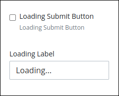
Enable the Loading Submit Button option, and then edit the default Loading Label setting text as necessary. The Loading Submit Button option replaces the interstitial Screen and instead displays the text entered in the Loading Label option along with a spinner within the submit button; the Screen does not refresh entirely until the next Task's Screen is ready to load. If this option is disabled, the interstitial Screen works as configured in the Form Task/Manual Task element.
Tooltip
Configure a tooltip that displays when hovering over the Submit Button control.
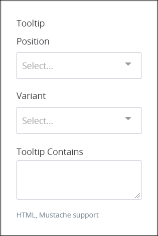
From the Position drop-down menu, select the position of the tooltip relative to the Submit Button control from the following options:
Top
Top Left
Top Right
Right
Right Top
Right Bottom
Bottom
Bottom Left
Bottom Right
Left
Left Top
Left Bottom
From the Variant drop-down menu, select the style for the tooltip:
Primary: Blue-colored background with white-colored Label text. This is the default option.
Secondary: Gray-colored background with white-colored Label text.
Success: Green-colored background with white-colored Label text.
Danger: Red-colored background with white-colored Label text.
Warning: Yellow-colored background with black-colored Label text.
Info: Teal-colored background with white-colored Label text.
Light: White-colored background with black-colored Label text.
Dark: Black-colored background with white-colored Label text.
In the Tooltip Contains setting, enter the text that the tooltip displays. This setting supports both HTML and mustache syntax.
Design Panel Settings
Expand the Design panel from the Properties Panel on the right to configure the following properties:
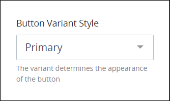
Button Variant Style
Select the style for the Submit Button control. The style changes the control's appearance but otherwise has no functional difference. Select from the following options:
Primary: Blue-colored background with white-colored Label text. This is the default option.
Secondary: Gray-colored background with white-colored Label text.
Success: Green-colored background with white-colored Label text.
Danger: Red-colored background with white-colored Label text.
Warning: Yellow-colored background with black-colored Label text.
Info: Teal-colored background with white-colored Label text.
Light: White-colored background with black-colored Label text.
Dark: Black-colored background with white-colored Label text.
Link: White-colored background with blue-colored Label text.
Advanced Panel Settings
Expand the Advanced panel from the Properties Panel on the right to configure the following properties:
Submit Information
The Submit Information setting allows screen designers to control exactly which variables are submitted when a user clicks the Submit button. This selective submission capability provides greater precision, improves data integrity, and helps optimize performance in complex or multi-user processes.
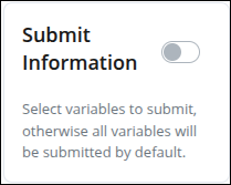
When enabled, designers can select specific variables from the screen’s data model—such as input fields, calculated values, and watcher-generated data—to include in the submission payload. All variables are selected by default; deselect any variables you do not want to submit.
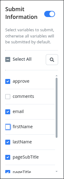
If no configuration is defined, or if all variables are deselected, the screen continues to submit all variables by default, ensuring full backward compatibility with existing Screens.
Visibility Rule
Specify an expression that indicates the condition(s) under which this control displays. See Expression Syntax Components. If this setting does not have an expression, then this control displays by default.
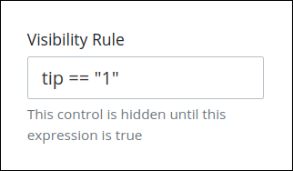
For example, this control displays if the variable value tip is 1. For a detailed example of the Visibility Rule setting, see Show or Hide Controls Based on Button Selection.
Note the following regarding how to use visibility rules:
To make this control hidden until another control contains a value, enter the Variable Name setting value of that control to this control's Visibility Rule setting.
See how to configure a Submit Button control that prevents the Request participant from clicking on that control multiple times so the Screen cannot be submitted after the first click.
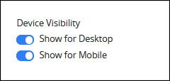
Device Visibility
Select on which device types this control displays:
Desktop: The control displays only on desktop devices. Enable the Show for Desktop toggle key.
Mobile: The control displays only on mobile devices. Enable the Show for Mobile toggle key.
Both: The control displays on both desktop and mobile devices. Both toggle keys are enabled by default.
CSS Selector Name
Enter the value to represent this control in custom CSS syntax when in Custom CSS mode. As a best practice, use the same CSS Selector Name value on different controls of the same type to apply the same custom CSS style to all those controls.
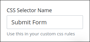
Then, use this name in the Custom CSS feature to apply CSS styling to this control as follows:
[selector='Submit Form'] {
    color: blueviolet;
}
See the following best practices regarding custom CSS in Screens:
See the following best practices regarding custom CSS in Screens:
Accessibility Panel Settings
The Accessibility panel centralizes settings that enhance screen-reader compatibility and overall usability. ARIA Label setting persists through import, copy/paste, versioning, and upgrades, supporting a more inclusive and standards-aligned Screen Builder experience.
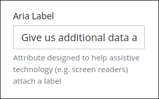
Aria Label
Enter the string that provides a text alternative to this control for the following purposes:
Assistive technology, such as screen readers, read the Aria Label setting value.
This control has a visual indication of its purpose, such as a button that uses a graphic instead of text, but still needs to clarify that purpose for anyone who cannot access the visual indication.
The Aria Label setting value replaces the Label setting value. For example, if a Submit Button control has both a Label setting value and an Aria Label setting value, assistive technology only uses the Aria Label setting value.
Tab Order
Tab order determines the sequential navigation order to navigate a Screen's controls using a keyboard interface. Assistive technology users often use a keyboard for navigation.
See best practices for setting the tab order for a Screen's controls.
Enter the number for the sequential keyboard navigation order that this control takes focus amongst other controls in this Screen.
