The Dynamic Panel is designed to simplify complex forms by displaying one item from an array at a time within a modular two-panel interface. This layout allows designers to create interactive forms where one side of the screen displays a list, and the other side shows detailed content for the selected item.
By focusing on a single item at a time, the Dynamic Panel reduces clutter, improves clarity, and enables users to confidently evaluate, update, and finalize decisions. Interfaces built with this feature adapt to user actions, reveal only relevant content, and guide users through multi-step workflows in a structured way.
Use Cases
The Dynamic Panel is ideal for scenarios such as:
Reviewing a list of applications or requests with expandable details
Approving pending items with supporting information
Performing side-by-side comparisons or structured decision-making
How It Works
The Dynamic Panel provides a two-column layout that connects a list of items to a detailed view of one item at a time.
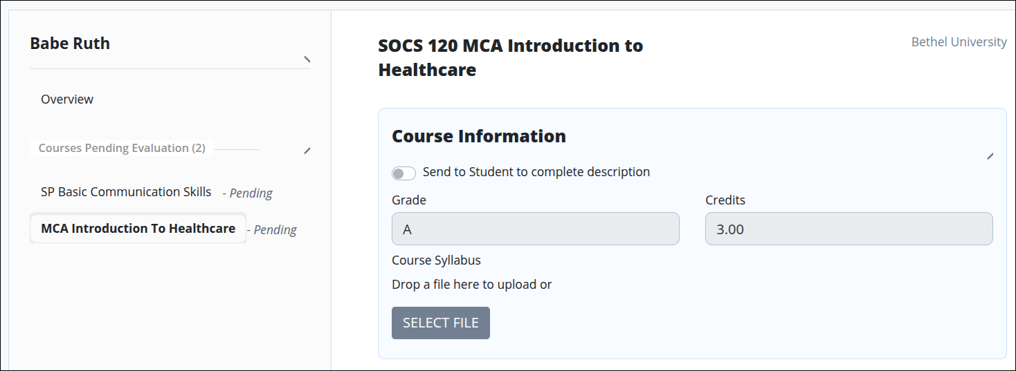
Left Panel: Displays a list of items, such as invoices numbers, dates, or course titles.
Right Panel: Displays detailed information and editable fields for the item selected in the left panel.
The layout is built in the Screen Builder using standard controls, variables, and scripting. Data flows between the two panels using index variables and custom handlers, ensuring the correct details are displayed whenever a user selects an item from the list.
Permissions
Your user account or group membership must have the following permissions to design a Screen unless your user account has the Make this user a Super Admin setting selected:
Screens: Edit Screens
Screens: View Screens
See the Screens permissions or ask your Administrator for assistance.
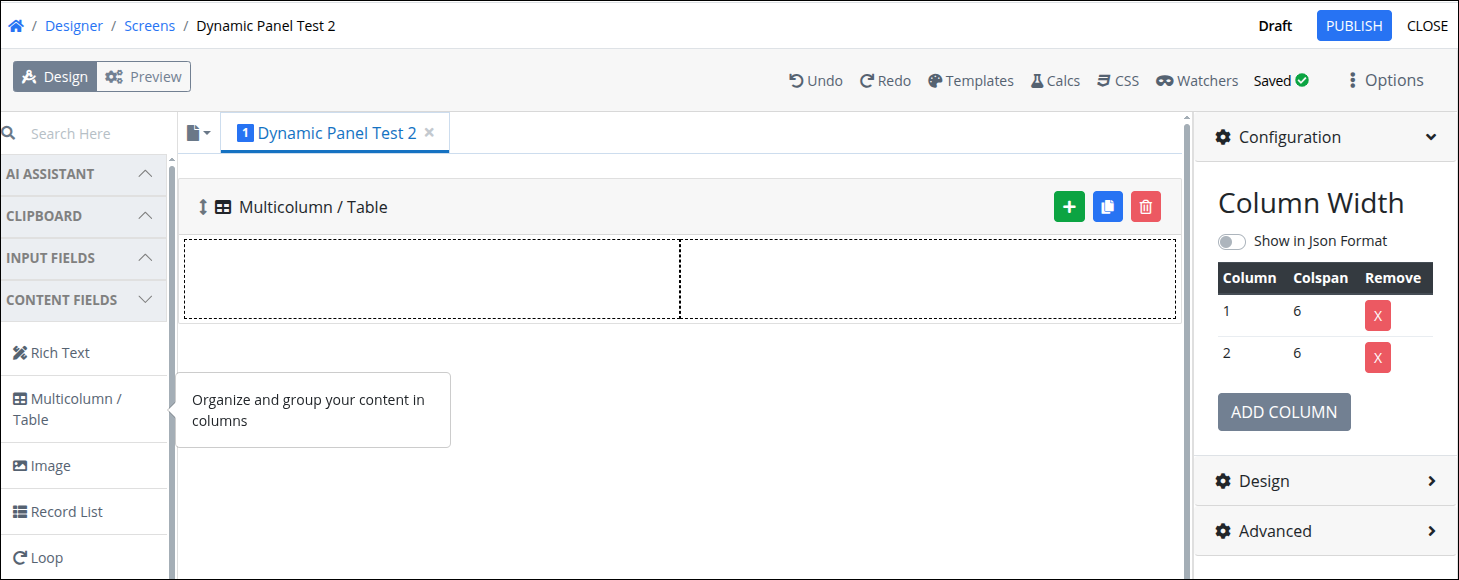
Step 1: Add a Multicolumn Control
To support the two panel layout, first add a Multicolumn control.
From the Controls Menu on the left, expand the Content Fields category, and then locate the Multicolumn/Table icon.
Drag and drop the control in the screen.
Step 2: Complete the Left Panel
Follow these steps to build the list in the left panel of the screen:
Add a Loop control to act as an array container for all related controls.
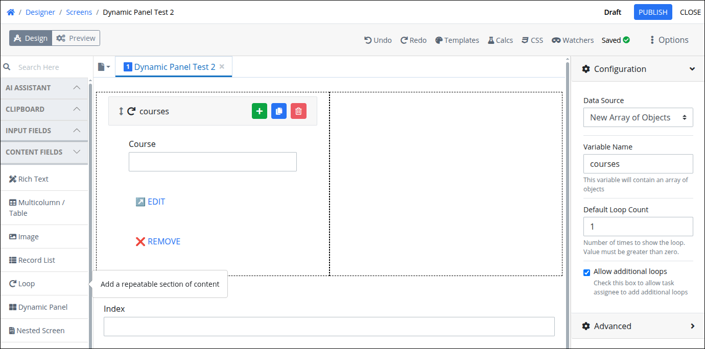
In the Loop Variable Name, enter
courses.Check Allow additional loops.
Within the loop:
Add one or more controls as needed based on your form design.
Add Submit Buttons for actions like Edit or Remove, then change their type to Regular Buttons.
Below the Multicolumn control, add a Line Input to capture the current index of the loop. This Line Input should use the same Variable Name as the
indexused in your loop logic, ensuring it reflects the selected item’s position within the array.
Step 3: Add a Dynamic Panel
Follow these steps to add to add a Dynamic Panel control:
From the Controls Menu on the left, expand the Content Fields category, and then locate the Dynamic Panel icon.
Drag and drop the control in the screen.
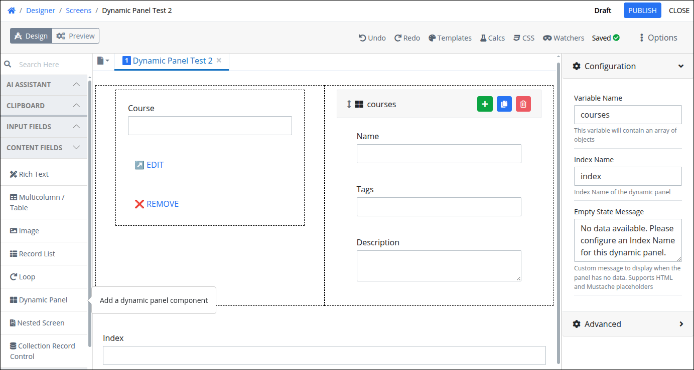
Add the necessary controls to display data from the selected item in the loop.
Ensure that the Course field in the left panel and the Name field in the Dynamic Panel share the same variable name. This ensures that when the Edit button is clicked, the correct data is displayed and updated.
Open the Configuration settings from the Properties Panel on the right side, and configure the following options:
In the Variable Name, enter
courses.In the Index Name, enter
index.
For more details about these settings, refer to the following expandable sections below.
Variable Name
Edit the default Variable Name setting value for this control if necessary. The Variable Name setting value represents data in this control during Requests. This is a required setting.
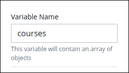
Use the Variable Name setting value in the following ways:
Reference this control by its Variable Name setting's value. The Data Preview panel in Preview mode corresponds with the Dynamic Panel control's Variable Name value. For example,
coursesis the Variable Name setting's value, which is an array of objects.Reference this control's value in a different Screen Builder control. To do so, use mustache syntax and reference this control's Variable Name value in the target control. Example:
{{ courses }}.Reference this value in Visibility Rule setting expressions.
See best practices when editing a Request variable name.
Index Name
Specify which record from an array will be displayed within a Dynamic Panel. This setting is essential for enabling navigation across different items in a loop. It supports mustache syntax, allowing you to reference dynamic values from request data.
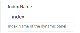
For example, use
indexto update the content shown in the right-hand panel based on the selected item from a list on the left. If not using a variable name in brackets, take into account that an array index start from0.By configuring Index Name, designers can:
Control the record shown in the dynamic panel.
Create responsive two-panel interfaces that react to user selections.
Dynamically update views without requiring custom routing or additional screens.
Empty State Message
Defines what is displayed in the dynamic panel when there is no data available to show. This message acts as feedback for users when no record is selected or when the configuration is incomplete—especially when the Index Name setting has not been defined. Default message is the following:
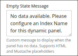
This field supports:
HTML formatting for rich presentation. (e.g.,
<p style="color:gray;font-size:14px;">No matching data found. Please configure an <strong>Index Name</strong> for this dynamic panel.</p>)Mustache syntax (e.g.,
{{variable}}) for dynamic data placeholders.
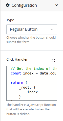
Step 4: Configure the Click Handler
Add JavaScript code to handle actions in regular buttons. Follow these steps to configure the Click Handler for a button control:
In the left panel, select the Edit and Remove button. The Variable settings display at the right-side of the Screen designer.
Expand the Configuration panel.
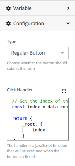
Enter the following JavaScript code for the Edit button:
// Get the index of the current course in the loop
const index = data.courses.indexOf(this)

return {
    _root: {
        index
    }
}
What this code is for:
data.coursesis a list (an array) of all the courses.thisrefers to the course currently being shown on screen.indexOf(this)checks where in the list the current course is located.The result is a number (like 0, 1, 2, etc.) representing that position.
This number is saved in a variable called
index.Finally, it sends that
indexvalue to the_root, which makes it available in the screen and especially useful for a Dynamic Panel that depends on knowing "which item are we showing?"
Enter the following JavaScript code for the Remove button:
const index = data.courses.indexOf(this)
const courses = data.courses;
courses.splice(index, 1);

return {
    _root: {
        courses
    }
}
What this code is for:
data.coursesis the full list of courses currently available.thisrefers to the course the user is currently interacting with (maybe the one they clicked on).indexOf(this)checks where that course is located in the list and stores that position in the variableindex.courses.splice(index, 1)means:Go to that exact position in the list.
Remove 1 item from that spot.
The updated list—without the removed course—is returned so the screen can refresh and show the new version.
Step 5: Configure Advanced Settings (Optional)
Expand the Advanced settings from the Properties Panel on the right to configure the following properties:
Visibility Rule
Specify an expression that indicates the condition(s) under which this control displays. See Expression Syntax Components. If this setting does not have an expression, then this control displays by default.
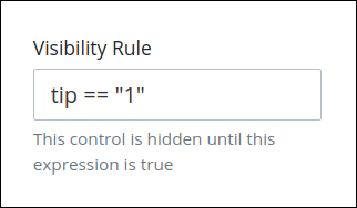
For example, this control displays if the variable value tip is 1. For a detailed example of the Visibility Rule setting, see Show or Hide Controls Based on Button Selection.
Note the following regarding how to use visibility rules:
To make this control hidden until another control contains a value, enter the Variable Name setting value of that control to this control's Visibility Rule setting.
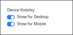
Device Visibility
Select on which device types this control displays:
Desktop: The control displays only on desktop devices. Enable the Show for Desktop toggle key.
Mobile: The control displays only on mobile devices. Enable the Show for Mobile toggle key.
Both: The control displays on both desktop and mobile devices. Both toggle keys are enabled by default.
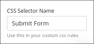
CSS Selector Name
Enter the value to represent this control in custom CSS syntax when in Custom CSS mode. As a best practice, use the same CSS Selector Name value on different controls of the same type to apply the same custom CSS style to all those controls.
Then, use this name in the Custom CSS feature to apply CSS styling to this control as follows:
[selector='Submit Form'] {
    color: blueviolet;
}
See the following best practices regarding custom CSS in Screens: