The File Upload control allows users to upload one or more files from their local computer or accessible network location. Users can either drag and place the files on the control or select a button from which to locate the files for upload.
When a file is uploaded to a Screen during an in-progress Case, then submitted, that file can be downloaded from the Files tab in that Case summary.
This control is only available for Form-type Screens. See Screen Types.
The File Upload control is not available in Preview mode.
Watch the following product tour to learn how to use a File Download control.
Need a solution to upload multiple files to a Screen that limits the number of files that maybe uploaded to a File Upload control? See how to use a Loop control to limit how many files may be uploaded to a Screen.
Add the Control to a Screen
Permissions
Your user account or group membership must have the following permissions to design a Screen unless your user account has the Make this user a Super Admin setting selected:
Screens: Edit Screens
Screens: View Screens
See the Screens permissions or ask your Administrator for assistance.
Follow these steps to add this control to the Screen:
From the Controls Menu on the left, expand the Files category, and then locate the File Upload icon
 .
.Drag and drop the control to the Screen Builder canvas. Existing controls in the Screen will adjust positioning based on where you drag the control.
Configure the File Upload control. See Settings.
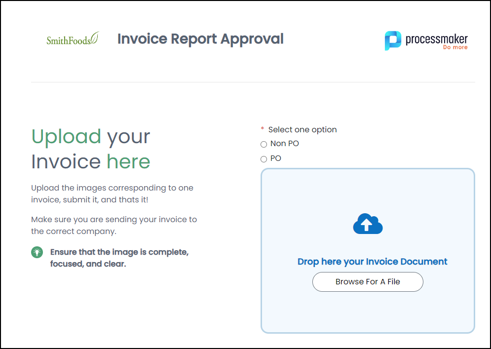
The following screen uses a File Upload control where users can upload invoice documents.
Settings
The File Upload control has the following configurable settings in the Properties Panel:
Variable Panel Settings
Expand the Variable panel from the Properties Panel on the right to configure the following settings:
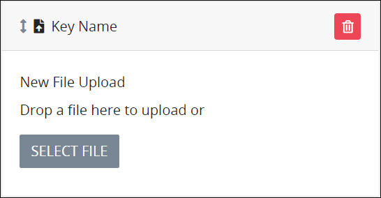
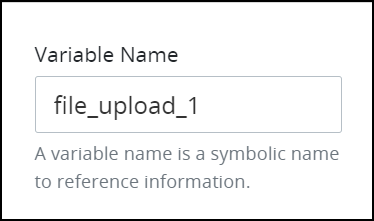
Variable Name
Enter the name of the uploaded file.
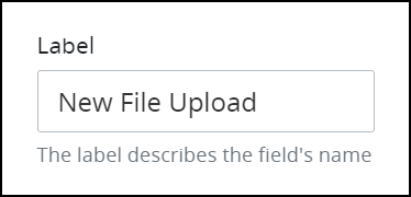
Label
Edit the default label that displays for this control if necessary. New File Upload is the default value.
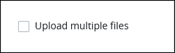
Upload Multiple Files
Select the Upload multiple files setting to allow the Screen user to upload multiple files at once using this File Upload control.
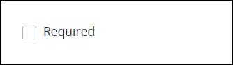
Required
Select the Required setting to require a file be uploaded before the Screen can be submitted. This setting is not selected by default.
Configuration Panel Settings
Expand the Configuration panel from the Properties Panel on the right to configure the following properties:
Accepted File Formats
Enter the file type(s) this control accepts for upload by referencing their MIME types. Separate multiple MIME types with commas (,). One space after each comma is acceptable.
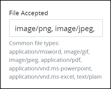
Accepted File Formats:
The File Upload control supports the following formats:.pdf, .doc, .docx, .xls, .xlsx, .ppt, .pptx, .txt, .jpg, .jpeg, .png, .gif, .mp3, .mp4, .csv, .svg
These extensions should be mapped to their corresponding MIME types. For example:
application/pdf, application/msword, application/vnd.openxmlformats-officedocument.wordprocessingml.document,
application/vnd.ms-excel, application/vnd.openxmlformats-officedocument.spreadsheetml.sheet,
application/vnd.ms-powerpoint, application/vnd.openxmlformats-officedocument.presentationml.presentation,
text/plain, image/jpeg, image/png, image/gif, audio/mpeg, video/mp4, text/csv, image/svg+xml
Example:
To successfully upload .DOCX files, add the MIME type for .DOCX to the file accepted configuration:
application/vnd.openxmlformats-officedocument.wordprocessingml.documentNote:
When using the File Upload control, PDF files are scanned for potentially harmful content before being accepted. Uploads will be blocked and users will see a "dangerous content" warning if the PDF includes any of the following:
/JSor/JavaScriptobjects
/AA(Additional Actions) entries
/OpenActionentries that trigger scripts
/Launch,/RichMedia, or/MovieannotationsEmbedded file streams containing executable or suspicious MIME types
These restrictions are in place to protect users from uploading PDFs that could execute malicious code.
Advanced Panel Settings
Expand the Advanced panel from the Properties Panel on the right to configure the following settings:
Visibility Rule
Specify an expression that indicates the condition(s) under which this control displays. See Expression Syntax Components. If this setting does not have an expression, then this control displays by default.
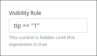
For example, this control displays if the variable value tip is 1. For a detailed example of the Visibility Rule setting, see Show or Hide Controls Based on Button Selection.
Note the following regarding how to use visibility rules:
To make this control hidden until another control contains a value, enter the Variable Name setting value of that control to this control's Visibility Rule setting.
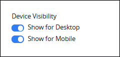
Device Visibility
Select on which device types this control displays:
Desktop: The control displays only on desktop devices. Enable the Show for Desktop toggle key.
Mobile: The control displays only on mobile devices. Enable the Show for Mobile toggle key.
Both: The control displays on both desktop and mobile devices. Both toggle keys are enabled by default.
CSS Selector Name
Enter the value to represent this control in custom CSS syntax when in Custom CSS mode. As a best practice, use the same CSS Selector Name value on different controls of the same type to apply the same custom CSS style to all those controls.
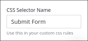
Then, use this name in the Custom CSS feature to apply CSS styling to this control as follows:
[selector='Submit Form'] {
    color: blueviolet;
}
See the following best practices regarding custom CSS in Screens:
Accessibility Panel Settings
The Accessibility panel centralizes settings that enhance screen-reader compatibility and overall usability. ARIA Label setting persists through import, copy/paste, versioning, and upgrades, supporting a more inclusive and standards-aligned Screen Builder experience.
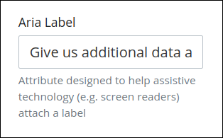
Aria Label
Enter the string that provides a text alternative to this control for the following purposes:
Assistive technology, such as screen readers, read the Aria Label setting value.
This control has a visual indication of its purpose, such as a controlthat uses a graphic instead of text, but still needs to clarify that purpose for anyone who cannot access the visual indication.
The Aria Label setting value replaces the Label setting value. For example, if a control has both a Label setting value and an Aria Label setting value, assistive technology only uses the Aria Label setting value.
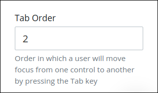
Tab Order
Tab order determines the sequential navigation order to navigate a Screen's controls using a keyboard interface. Assistive technology users often use a keyboard for navigation.
See best practices for setting the tab order for a Screen's controls.
Enter the number for the sequential keyboard navigation order that this control takes focus amongst other controls in this Screen.