Bootstrap wrapper controls enable users to group multiple controls into a single, collapsible container, which helps save space on a form. This feature is particularly useful for organizing complex forms, improving readability, and enhancing user experience by allowing sections of the form to be expanded or collapsed as needed.
This control is only available for Form-type Screens. See Screen Types.
Watch the following product tour to learn how to use a Bootstrap Wrapper control.
Add the Control to a Screen
Permissions
Your user account or group membership must have the following permissions to design a Screen unless your user account has the Make this user a Super Admin setting selected:
Screens: Edit Screens
Screens: View Screens
See the Screens permissions or ask your Administrator for assistance.
Follow these steps to add this control to the Screen:
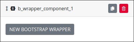
From the Controls Menu on the left, expand the Advanced category, and then locate the Bootstrap Wrapper icon
 .
.Drag and drop the control to the Screen Builder canvas. Existing controls in the Screen will adjust positioning based on where you drag the control.
Configure the Bootstrap Wrapper control. See Settings.
Validate that the control is configured correctly. See Validate Your Screen.
Settings
The Image control has the following panels that contain settings:
Variable Panel Settings
Expand the Variable panel from the Properties Panel on the right to configure the following properties:
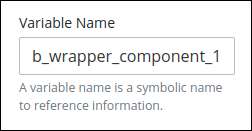
Variable Name
Edit the default Variable Name setting value for this control if necessary. The Variable Name setting value represents data in this control during Requests. Ensure that the Variable Name setting value is a unique name from other controls in this Screen and contains at least one letter. This is a required setting.
Use the Variable Name setting value in the following ways:
Reference this control by its Variable Name setting's value. The Data Preview panel in Preview mode represents the state of the Bootstrap Component control using its Variable Name value in the Request's JSON data model.
Reference this control's value in a different Screen Builder control. To do so, use mustache syntax and reference this control's Variable Name value in the target control. Example:
{{ b_wrapper_component_1 }}.Reference this value in Visibility Rule setting expressions.
See best practices when editing a Request variable name.
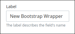
Label
Edit the default label that displays for this control if necessary. New Bootstrap Wrapper is the default value.
Configuration Panel Settings
Expand the Configuration panel from the Properties Panel on the right to configure the following properties:
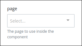
Page
In the page setting, select a page created in the same Screen to use in the component selected previously.
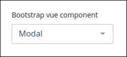
Component Configuration
In the Config setting, enter component BootstrapVue properties in JSON format.
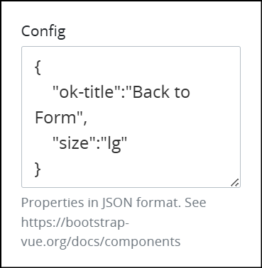
Refer to the following BootstrapVue documentation for property descriptions for each available wrap component:
For example, when using the Model component, the following properties can be configured:
{
    "ok-title":"Back to Form",
    "size":"lg"
}
Advanced Panel Settings
Expand the Advanced panel from the Properties Panel on the right to configure the following properties:
Visibility Rule
Specify an expression that indicates the condition(s) under which this control displays. See Expression Syntax Components. If this setting does not have an expression, then this control displays by default.
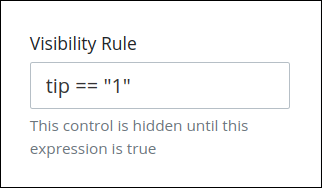
For example, this control displays if the variable value tip is 1. For a detailed example of the Visibility Rule setting, see Show or Hide Controls Based on Button Selection.
Note the following regarding how to use visibility rules:
To make this control hidden until another control contains a value, enter the Variable Name setting value of that control to this control's Visibility Rule setting.
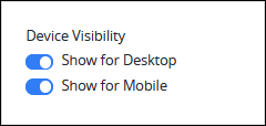
Device Visibility
Select on which device types this control displays:
Desktop: The control displays only on desktop devices. Enable the Show for Desktop toggle key.
Mobile: The control displays only on mobile devices. Enable the Show for Mobile toggle key.
Both: The control displays on both desktop and mobile devices. Both toggle keys are enabled by default.
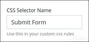
CSS Selector Name
Enter the value to represent this control in custom CSS syntax when in Custom CSS mode. As a best practice, use the same CSS Selector Name value on different controls of the same type to apply the same custom CSS style to all those controls.
Then, use this name in the Custom CSS feature to apply CSS styling to this control as follows:
[selector='Submit Form'] {
    color: blueviolet;
}