The line chart visualizes Saved Search results as data points on a line to show how those results trend. The following line chart shows the number of Requests by status type per day of the week.
.png)
Create a Line Chart
Follow these steps to create a line chart for a Saved Search:
View the search results for a Saved Search in which to create a chart. The Data tab displays the data details for that Saved Search.
Click the Charts tab. The Charts tab displays all charts created for this Saved Search.
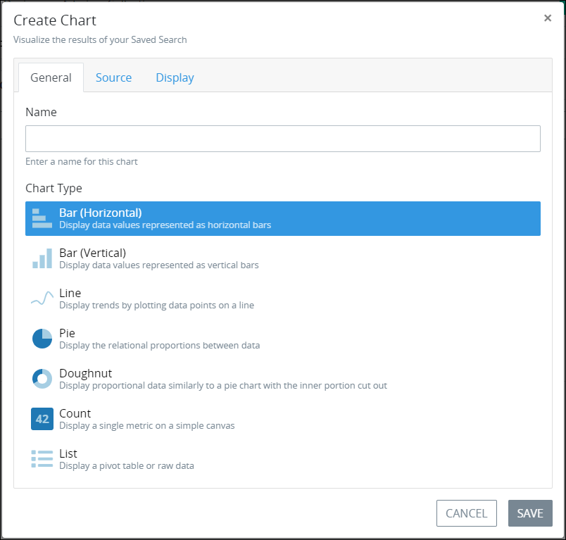
Click the +Chart button. The Create Chart screen displays the General tab.

In the Name setting, enter the name of the chart. This is a required setting.
From the Chart Type group, select the Line chart type to visualize the results of this Saved Search. Bar (Horizontal) is the default chart type.
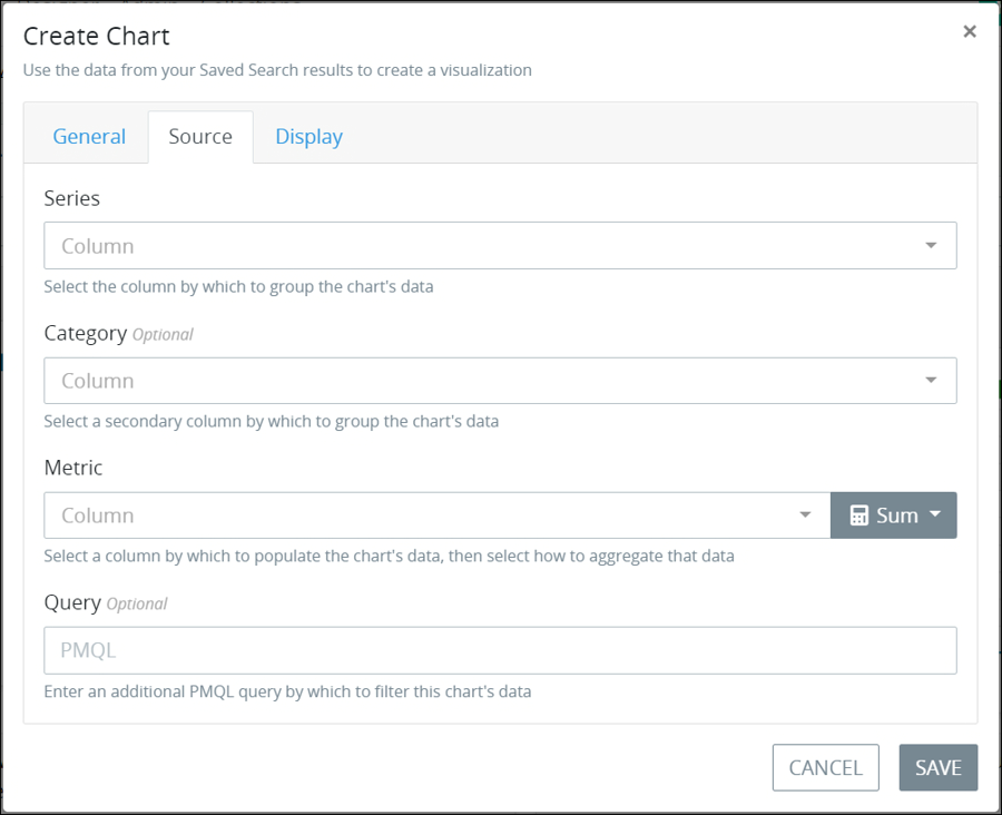
Click the Source tab to configure from which Saved Search's results to visualize in the chart.

From the Series setting, select how to group the chart data. The series groups the chart content by the units of measurement in the X-axis for applicable chart types. See chart example that references the series grouping. Options that display in the Series drop-down menu derive from the columns configured from the Saved Search tabular data as displayed from the Data tab of this Saved Search. The default configurable columns vary for each type of Saved Search. The Recommended indicator for Saved Search results represent dates, numbers, and/or unique text results and are recommended when configuring the chart series. This is a required setting for applicable charts.
From the Category setting, optionally select a secondary measurement by which to aggregate the chart series. See chart example that references the category measurement. The Category setting does not apply to count charts. Options and their recommendations that display in the Category setting are the same as those in the Series setting.
From the Metric setting, select the chart contents from the Saved Search tabular-formatted results to aggregate as well as how to aggregate that data. The Metric setting options are numerically-based Saved Search results such as # that represents the ID for the Request, Task, or Collection record associated with that Saved Search. See chart example that references how that chart data is aggregated.
Select from the following options how to aggregate the selected chart metric:
Average: The average is the arithmetic mean calculated by adding a group of values, and then dividing by the count of those items.
Count: The chart visualizes the number of values of the metric you select.
Minimum: The chart visualizes the minimum value of the metric you select.
Maximum: The chart visualizes the maximum value of the metric you select.
Median: The median is the middle value of a group of values that is calculated by sorting each of the values of the metric you select, then visualizing the middle value.
Sum: The sum is the arithmetic addition of each value of the metric you select. This is the default option.
This is a required setting.
In the Query setting, optionally enter a ProcessMaker Query Language (PMQL) query from which to further filter the Saved Search's results. See the following topics for information how to use PMQL for Requests, Tasks, and Collections:
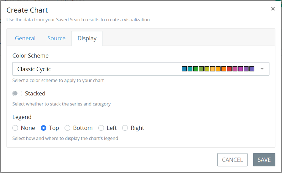
Click the Display tab to configure the appearance and style of the Saved Search chart.

From the Color Scheme setting, select the color palette from which to display the chart.
Enable the Stacked toggle key to stack the chart's data markers: overlay the data markers one another in the x- and y-axis. See this chart as an example of stacked data markers.
From the Legend setting, select where to place the legend in respect to the chart from the following options:
None: The chart legend does not display.
Top: The legend displays above the chart. This is the default option.
Bottom: The legend displays below the chart.
Left: The legend displays to the left of the chart.
Right: The legend displays to the right of the chart.
Click Save. If a required setting does not contain a value or selection, the following message displays: The given data was invalid.. Otherwise, the chart and the following message display: Successfully Created Chart.