The Line Input control is a text field that process participants can use to enter information. The Line Input control can be configured to accept the following data types:
Text: The control only accepts alphanumeric characters.
Integer: The control only accepts integers.
Currency: The control only accepts a currency value.
Percentage: The control only accepts a percentage value.
Decimal: The control only accepts a number, both positive and negative.
Datetime: The control only accepts a date with both date and time components.
Date: The control only accepts a date.
Password: The control accepts a password. Entered text is hidden.
This control is only available for the following Screen types:
Conversational
Form
See Screen Types.
Watch the following product tour to learn how to use a Line Input control.
Add the Control to a Screen
Permissions
Your user account or group membership must have the following permissions to design a Screen unless your user account has the Make this user a Super Admin setting selected:
Screens: Edit Screens
Screens: View Screens
See the Screens permissions or ask your Administrator for assistance.
Follow these steps to add this control to a Screen:
Create a new Form-type or Conversational-type Screen or edit an existing one.
From the Control Panel on the left, expand the Input Fields category, and then locate the Line Input icon
 .
.Drag and drop the control to the Screen Builder canvas. Existing controls in the Screen will adjust positioning based on where you drag the control.
Configure the Line Input control. See Settings.
Validate that the control is configured correctly. See Validate Your Screen.
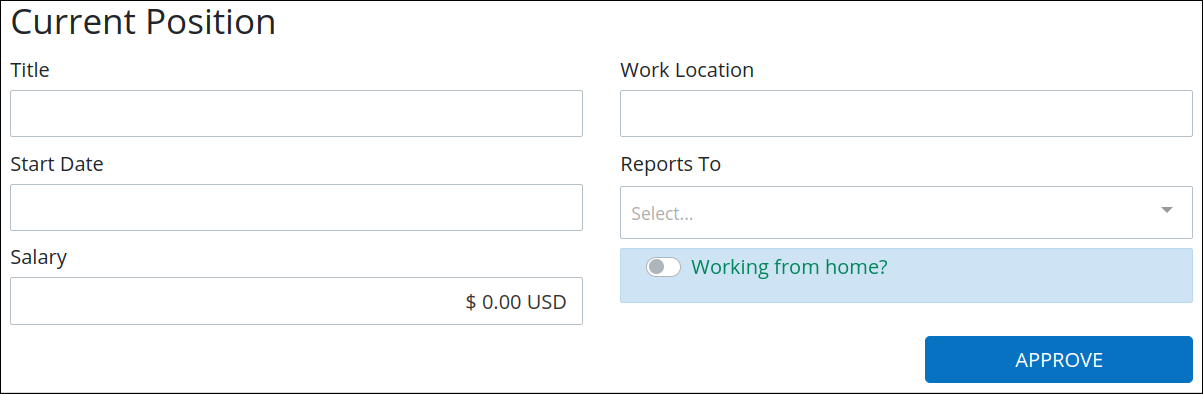
Following is a form with the Line Input controls for Title, Start Date, Salary, and Work Location.
Settings
Permissions
Your user account or group membership must have the following permissions to design a Screen unless your user account has the Make this user a Super Admin setting selected:
Screens: Edit Screens
Screens: View Screens
See the Screens permissions or ask your Administrator for assistance.
The Line Input control has the following configurable settings in the Properties Panel on the right:
Variable Panel Settings
Expand the Variable panel from the Properties Panel on the right to configure the following properties:
Variable Name
Edit the default Variable Name setting value for this control if necessary. The Variable Name setting value represents data in this control during cases and requests. Ensure that the Variable Name is unique and contains at least one letter. This is a required setting.
Use the Variable Name setting value in the following ways:
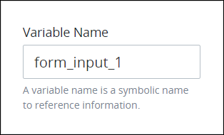
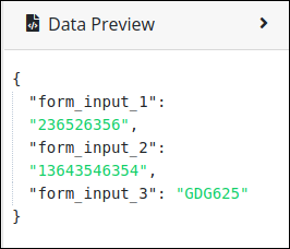
Reference this control by its Variable Name setting's value. The Data Preview panel in Preview mode corresponds the Line Input control's textual content with that Line Input control's Variable Name value. In the example below,
form_input_1is the Variable Name setting's value.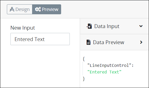
Reference this control's value in a different Screen Builder control. To do so, use mustache syntax and reference this control's Variable Name value in the target control. Example:
{{ form_input_1 }}.Reference this value in Visibility Rule setting expressions.
See best practices when editing a Request variable name.
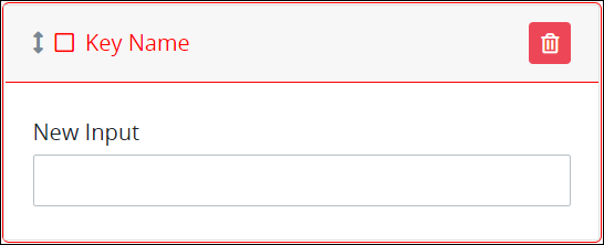
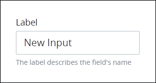
Label
Edit the default label that displays for this control if necessary. New Input is the default value.
Ensure that all Line Input controls implemented in a Conversational-type Screen contain Label setting values. See Controls in Conversational-Type Screens Require Labels.
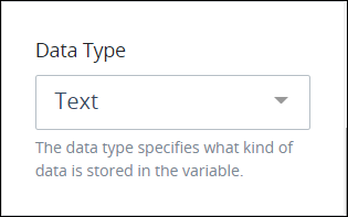
Data Type
This is a required setting. Select one of the following options to restrict the data type this control accepts when users enter content into this control:
Text: The control only accepts alphanumeric characters. Text is the default setting.
Integer: The control only accepts integers.
Currency: The control only accepts a currency value.
Percentage: The control only accepts a percentage value.
Decimal: The control only accepts any number, both positive and negative.
Datetime: The control only accepts a datetime, which is includes both date and time components.
Date: The control only accepts a date.
Password: The control accepts a password. Entered text is hidden.
The following message displays below the control if a user enters a value that does not comply with this control's data type: The format is invalid.
Currency and Percentage
When using Currency and Percentage data types, data formatting is not saved in the linked Request variable. Therefore, the formatting will not be available if the variable is used elsewhere in that Request. For example, instead of saving the value as $50.00, the Request variable will only save it as 50.
By default, the Currency data type will add a value 0.00. If the control is marked as required, 0 is still considered a valid input, and no validation alert will be shown if it is not changed or edited.
Validation Rules
Enter the validation rule(s) the Request participant must comply with to properly enter a valid value into this control. This setting has no default value. If there are no configured validation rules the following message displays: No validation rule(s). See Validation Rules for "Validation" Control Settings.

Access the Variable panel for this control while in Design mode, and then locate the Validation Rules setting.
Click the Add Rule button. The Select drop-down menu displays.
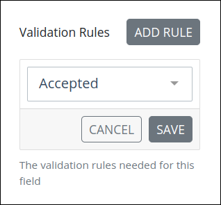
Select the rule that this control validates against.
Click Save. Parameters for the selected rule display. Parameter settings display which ones are required to properly configure the rule.
Enter the parameter settings that this control uses to validate against. See Validation Rule Settings, and then locate the validation rule for its parameters.
Follow these steps to edit a validation rule for this control:
Access the Variable panel for this control while in Design mode, and then locate the Validation Rules setting.
Click the Edit icon
 for the validation rule to edit if that rule can be edited. Validation rules that do not have parameters cannot be edited. The parameter settings for that validation rule displays.
Edit the parameter settings that this control uses to validate against. See Validation Rule Settings, and then locate the validation rule for its parameters.
Follow these steps to delete a validation rule for this control:
Access the Variable panel for this control while in Design mode, and then locate the Validation Rules setting.
Click the Delete icon
 for the validation rule to delete. A message displays to confirm deletion of the validation rule.
Click Delete.
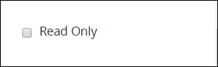
Required and Read Only
Make Required
Select to indicate that this control is required. This option is not selected by default. This is a quick way to add the Required validation rule.
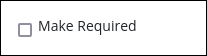
In the Screen preview or during a Request, the control displays with a red-colored asterisk. If you submit the Screen without selecting this required Checkbox, this control displays Field is required in red-colored text.

Read Only
Select to indicate that this control cannot be edited. This option is not selected by default.
Configuration Panel Settings
Expand the Configuration panel from the Properties Panel on the right to configure the following properties:
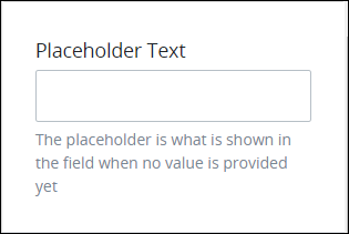
Placeholder Text
Enter the placeholder text that displays in this control when no value has been provided. This setting has no default value.
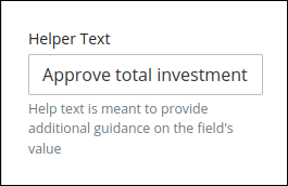
Helper Text
Enter text that provides additional guidance on this control's use. This setting has no default value.
Design Panel Settings
Expand the Design panel from the Properties Panel on the right to configure the following properties:
Text Color
Select the text color that displays for this control. Optionally, click the Clear Color Selection option to remove the selected color.

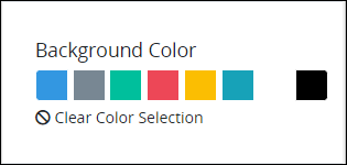
Background Color
Select the background color that displays for this control. Optionally, click the Clear Color Selection option to remove the selected color.
Advanced Panel Settings
Expand the Advanced panel from the Properties Panel on the right to configure the following properties:
Default Value
Enter the default value this control displays. The default value can be assigned as a Request variable, text or JavaScript. When the Screen submits, the Request uses this control's default value unless the Request participant changes it. When using a Request variable in the Default Value setting, consider the following:
If the Request variable is empty, the control does not display any value by default.
When the Request variable is assigned a value for the first time, this value becomes the permanent default value of the control.
Any further changes to the Request variable do not affect the default value of the control.
The Default Value setting supports using Request variables in mustache syntax. For example, if the Default Value setting is {{ FirstName }} {{ LastName }} from which a Request participant entered her first name and last name in separate controls (respectively) earlier in that Request, this control displays the contents of those controls by default during the Request.
There are two ways to enter the default value this control displays.
Enter the default value as text or use a Request variable in mustache syntax.
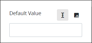
Enter the default value as JavaScript, especially if a Calculated Property might change this default value setting. Ensure to use the this. JavaScript keyword preceding the Screen control reference. Example: this.FullName when FullName is the Variable Value setting value for the control to set its default value.

Numbers as a string are concatenated. To set the expected number result as the default value using JavaScript, enter return 0; instead of 0.
Visibility Rule
Specify an expression that indicates the condition(s) under which this control displays. See Expression Syntax Components. If this setting does not have an expression, then this control displays by default.
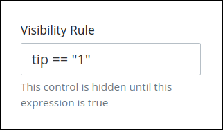
For example, this control displays if the variable value tip is 1. For a detailed example of the Visibility Rule setting, see Show or Hide Controls Based on Button Selection.
Note the following regarding how to use visibility rules:
To make this control hidden until another control contains a value, enter the Variable Name setting value of that control to this control's Visibility Rule setting.
Device Visibility
Select on which device types this control displays:
Desktop: The control displays only on desktop devices. Enable the Show for Desktop toggle key.
Mobile: The control displays only on mobile devices. Enable the Show for Mobile toggle key.
Both: The control displays on both desktop and mobile devices. Both toggle keys are enabled by default.

Custom Format String
Enter a mask pattern to require a custom input format. If this setting does not have a mask pattern, then this control adds plain text without formatting.

Date, SSN and Phone mask pattern display as examples.
Use the following mask components to compose your mask pattern:
Examples
Set the Social Security Number (SSN) using the mask pattern
###-##-####. Then, the Line Input control only allows numeric values with that pattern.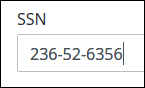
Additionally, to ensure that users enter the correct number of digits, use Validation Rules to set Max Length and Min Length of this control to
9.Set a US phone number using the mask pattern
+1 (###) ###-####. Then, the Line Input control only allows numeric values preceding the US telephone code by default.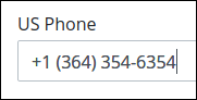
Additionally, use the Min Length and Max Length Validation Rules to define character length boundaries for this control.
Set a car license plate that complies with the format for a specific US state, such as
AAA ###. Then, the Line Input control only allows upper case alphabetic characters followed by numeric values.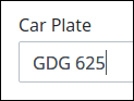
Additionally, use the Min Length and Max Length Validation Rules to define character length boundaries for this control.
The Data Preview panel displays the entered text without the mask patterns.
This custom format input overrides any other formatting set by default, including the one described when using scripts.
CSS Selector Name
Enter the value to represent this control in custom CSS syntax when in Custom CSS mode. As a best practice, use the same CSS Selector Name value on different controls of the same type to apply the same custom CSS style to all those controls.

Then, use this name in the Custom CSS feature to apply CSS styling to this control as follows:
[selector='Submit Form'] {
    color: blueviolet;
}
See the following best practices regarding custom CSS in Screens:
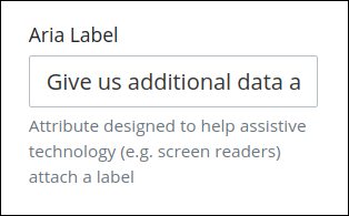
Aria Label
Enter the string that provides a text alternative to this control for the following purposes:
Assistive technology, such as screen readers, read the Aria Label setting value.
This control has a visual indication of its purpose, such as a control that uses a graphic instead of text, but still needs to clarify that purpose for anyone who cannot access the visual indication.
The Aria Label setting value replaces the Label setting value. For example, if a control has both a Label setting value and an Aria Label setting value, assistive technology only uses the Aria Label setting value.
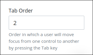
Tab Order
Tab order determines the sequential navigation order to navigate a Screen's controls using a keyboard interface. Assistive technology users often use a keyboard for navigation.
See best practices for setting the tab order for a Screen's controls.
Enter the number for the sequential keyboard navigation order that this control takes focus amongst other controls in this Screen.
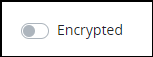
Encryption
The Encrypted setting allows designers to securely collect and manage sensitive data within forms. This feature ensures that confidential information is protected by encryption algorithms, stored securely in the system, and only accessible to authorized users. The Encrypted setting also offers the ability to reveal or conceal content for ease of use while maintaining security.
Follow these instructions to configure encryptions:
Enable the Encrypted toggle key.
In the Users/Groups to View setting, select groups or users allowed to view the data displayed in this control. Only these authorized individuals will be able to decrypt and view the data.
Considerations
If the field already contains data in plain text, it will remain unchanged. However, once encryption is enabled, users can choose to encrypt the existing data using the Conceal option.
Encrypted fields are not available for web entries within start events.
Encrypted fields are excluded from the JSON data available in case history.
In the following example, the selected users have been granted access to view the encrypted field.
.png "image(329).png")
When viewing the form, they can click the Reveal button to decrypt and view the encrypted field's content.

The data can be hidden again using the Conceal the content, ensuring that sensitive information remains hidden from unauthorized users.

Use Cases
Securing Personal Identifiable Information (PII): Encrypt sensitive data like social security numbers, health records, or financial information to ensure privacy and compliance with security standards.
Controlled Access: Restrict user access to view or decrypt sensitive employee data.
Real-Time Encryption: Ensure data is securely encrypted as it is being entered, preventing unauthorized access in real-time.