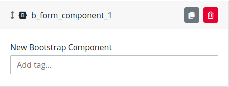
Add a control that has BootstrapVue Component library support.
Control Description
ProcessMaker Platform supports adding BootstrapVue components in Forms. Use BootstrapVue to display responsive, mobile-first, and ARIA-accessible forms projects on the Web.
This control is only available for Form-type Screens. See Screen Types.
Watch the following product tours to learn how to use a Bootstrap Component control.
Bootstrap Component control using Embed property
Add the Control to a Screen
Permissions
Your user account or group membership must have the following permissions to design a Screen unless your user account has the Make this user a Super Admin setting selected:
Screens: Edit Screens
Screens: View Screens
See the Screens permissions or ask your Administrator for assistance.
Follow these steps to add this control to the Screen:
From the Controls Menu on the left, expand the Advanced category, and then locate the Bootstrap Component icon
 .
.Drag and drop the control to the Screen Builder canvas. Existing controls in the Screen will adjust positioning based on where you drag the control.
Configure the Bootstrap Component control. See Settings.
Validate that the control is configured correctly. See Validate Your Screen.
Settings
The Image control has the following panels that contain settings:
Variable Panel Settings
Expand the Variable panel from the Properties Panel on the right to configure the following properties:
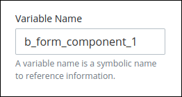
Variable Name
Edit the default Variable Name setting value for this control if necessary. The Variable Name setting value represents data in this control during Requests. Ensure that the Variable Name setting value is a unique name from other controls in this Screen and contains at least one letter. This is a required setting.
Use the Variable Name setting value in the following ways:
Reference this control by its Variable Name setting's value. The Data Preview panel in Preview mode represents the state of the Bootstrap Component control using its Variable Name value in the Request's JSON data model.
Reference this control's value in a different Screen Builder control. To do so, use mustache syntax and reference this control's Variable Name value in the target control. Example:
{{ b_form_component_1 }}.Reference this value in Visibility Rule setting expressions.
See best practices when editing a Request variable name.
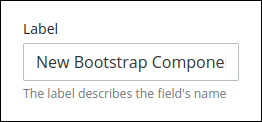
Label
Edit the default label that displays for this control if necessary. New Bootstrap Component is the default value.
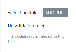
Validation Rules
Enter the validation rule(s) the Request participant must comply with to properly enter a valid value into this control. This setting has no default value. If there are no configured validation rules the following message displays: No validation rule(s). See Validation Rules for "Validation" Control Settings.
Access the Variable panel for this control while in Design mode, and then locate the Validation Rules setting.
Click the Add Rule button. The Select drop-down menu displays.
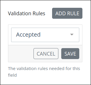
Select the rule that this control validates against.
Click Save. Parameters for the selected rule display. Parameter settings display which ones are required to properly configure the rule.
Enter the parameter settings that this control uses to validate against. See Validation Rule Settings, and then locate the validation rule for its parameters.
Follow these steps to edit a validation rule for this control:
Access the Variable panel for this control while in Design mode, and then locate the Validation Rules setting.
Click the Edit icon
 for the validation rule to edit if that rule can be edited. Validation rules that do not have parameters cannot be edited. The parameter settings for that validation rule displays.
Edit the parameter settings that this control uses to validate against. See Validation Rule Settings, and then locate the validation rule for its parameters.
Follow these steps to delete a validation rule for this control:
Access the Variable panel for this control while in Design mode, and then locate the Validation Rules setting.
Click the Delete icon
 for the validation rule to delete. A message displays to confirm deletion of the validation rule.
Click Delete.
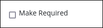
Make Required
Select to indicate that this control is required. This option is not selected by default. This is a quick way to add the Required validation rule.
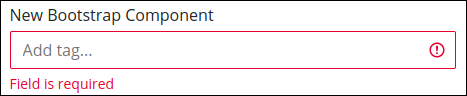
In the Screen preview or during a Request if you submit the Screen without selecting this required Bootstrap Component control, this control displays Field is required in red-colored text.
Configuration Panel Settings
Expand the Configuration panel from the Properties Panel on the right to configure the following properties:
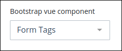
BootstrapVue Component
In the Bootstrap vue component setting, select one of the following BootstrapVue components ProcessMaker Platform supports. The following hyperlinks reference BootstrapVue documentation for their descriptions:
The Form Tags setting is selected by default.
Component Configuration
In the Config setting, enter component BootstrapVue properties in JSON format.
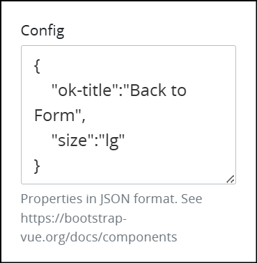
Refer to the following BootstrapVue documentation for property descriptions for each available component:
Example
If using an image component, use the property src and fluid:
{
     "src":"https://picsum.photos/1024/400/?image=41",
     "fluid":"true"
}
Advanced Panel Settings
Expand the Advanced panel from the Properties Panel on the right to configure the following properties:
Visibility Rule
Specify an expression that indicates the condition(s) under which this control displays. See Expression Syntax Components. If this setting does not have an expression, then this control displays by default.
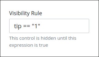
For example, this control displays if the variable value tip is 1. For a detailed example of the Visibility Rule setting, see Show or Hide Controls Based on Button Selection.
Note the following regarding how to use visibility rules:
To make this control hidden until another control contains a value, enter the Variable Name setting value of that control to this control's Visibility Rule setting.
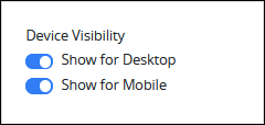
Device Visibility
Select on which device types this control displays:
Desktop: The control displays only on desktop devices. Enable the Show for Desktop toggle key.
Mobile: The control displays only on mobile devices. Enable the Show for Mobile toggle key.
Both: The control displays on both desktop and mobile devices. Both toggle keys are enabled by default.
CSS Selector Name
Enter the value to represent this control in custom CSS syntax when in Custom CSS mode. As a best practice, use the same CSS Selector Name value on different controls of the same type to apply the same custom CSS style to all those controls.
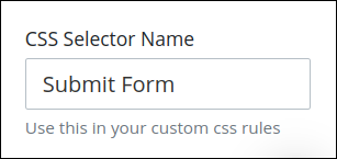
Then, use this name in the Custom CSS feature to apply CSS styling to this control as follows:
[selector='Submit Form'] {
    color: blueviolet;
}
See the following best practices regarding custom CSS in Screens: