Screen controls available in the ProcessMaker Platform include several accessibility settings that help ensure compliance with ADA and WCAG guidelines. These settings include:
ARIA Labels: Provide descriptive labels for screen readers to improve usability for visually impaired users.
Keyboard Focus Order: Define the navigation order for users who rely on keyboard input (e.g., using the Tab key).
Mobile Responsiveness: Ensure controls adapt to various screen sizes and devices for consistent user experience.
Custom Appearance (CSS): Apply custom styles to enhance readability, visual contrast, or meet branding requirements.
Color Scheme: Customize colors for individual controls to ensure sufficient contrast and improve visual accessibility. This allows designers to align components with WCAG contrast ratio requirements at a granular level.
These settings are available within the Design, Advanced, and Accessibility panels of each control’s configuration. A brief description of each setting is provided below. For detailed information on how these settings apply to specific controls, refer to the individual control documentation linked in this list.
Design Panel Settings
Select a text and background color for the control:
Text Color
Select the text color that displays for this control. Optionally, click the Clear Color Selection option to remove the selected color.

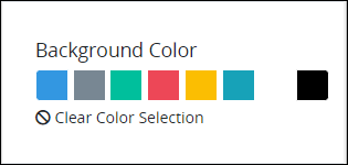
Background Color
Select the background color that displays for this control. Optionally, click the Clear Color Selection option to remove the selected color.
Advanced Panel Settings
Configure the following advanced control settings:
Device Visibility
Select on which device types this control displays:
Desktop: The control displays only on desktop devices. Enable the Show for Desktop toggle key.
Mobile: The control displays only on mobile devices. Enable the Show for Mobile toggle key.
Both: The control displays on both desktop and mobile devices. Both toggle keys are enabled by default.

CSS Selector Name
Enter the value to represent this control in custom CSS syntax when in Custom CSS mode. As a best practice, use the same CSS Selector Name value on different controls of the same type to apply the same custom CSS style to all those controls.

Then, use this name in the Custom CSS feature to apply CSS styling to this control as follows:
[selector='Submit Form'] {
    color: blueviolet;
}
See the following best practices regarding custom CSS in Screens:
Accessibility Panel Settings
The Accessibility panel centralizes settings that enhance screen-reader compatibility and overall usability. ARIA Label setting persists through import, copy/paste, versioning, and upgrades, supporting a more inclusive and standards-aligned Screen Builder experience.
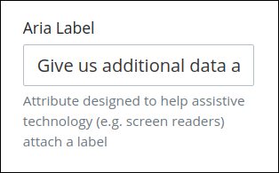
Aria Label
Enter the string that provides a text alternative to this control for the following purposes:
Assistive technology, such as screen readers, read the Aria Label setting value.
This control has a visual indication of its purpose, such as a control that uses a graphic instead of text, but still needs to clarify that purpose for anyone who cannot access the visual indication.
The Aria Label setting value replaces the Label setting value. For example, if a control has both a Label setting value and an Aria Label setting value, assistive technology only uses the Aria Label setting value.
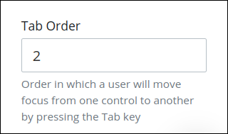
Tab Order
Tab order determines the sequential navigation order to navigate a Screen's controls using a keyboard interface. Assistive technology users often use a keyboard for navigation.
See best practices for setting the tab order for a Screen's controls.
Enter the number for the sequential keyboard navigation order that this control takes focus amongst other controls in this Screen.